Not all that long ago, when someone mentioned data visualization images, graphics printed in the USA Today, New York Times or the Economist would instantly come to mind – not any more. Over the last two to three years there has been an explosion in the popularity of data visualization. There’s no question that data visualization is hot right now, but why? Why have we become so fascinated with data visualization? Why is it desirable and why is it useful?
Today, it seems that whenever anyone mentions a new infographic or data visualization, hoards of people instantly line up to check it out. If any of you are like me, then I’m sure that there’s a little part of you that wonders why? If you’ve ever pondered this, then today we’re going to set you straight. In a post on the data visualization blog, Visually, Noah Lliinsky explains why data visualization is so popular.
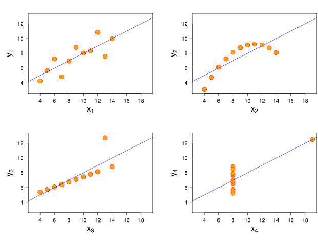
According to Lliinsky, the reason why we are so enamored with data visualization is because it’s been written into our DNA. Lliinsky writes, “To answer these questions, we need to go all the way back to biology…fundamentally, our visual system is extremely well built for visual analysis.” Here, he points out the fact that most of the time, the most important messages in data are typically represented in patterns and pattern violations? Unsure or don’t believe him? Lliinsky will win you over with this powerful example. Check out Anscombe’s Quartet (below). Created by statistician, Francis Anscombe, it is a series of four different data sets that share many of the same characteristics. The point of this data example, is to show that if you only quickly glance at the data you’d be hard pressed to find any real differentiation between the data series. However, once graphed it quickly becomes apparent that there are substantial differences between each of the data sets.
The point of above example is to illustrate why data visualization is so important. Lliinsky states, “One of the most important benefits of visualization is that is allows us access to huge amounts of data in ways that would not be otherwise possible.”
Another reason why we’re so infatuated with data visualization is because it helps arrange data in a format that allows it to be easily and quickly understood. Lliinsky writes, “The knowledge encompassed in these various data sets would be nearly inaccessible to the causal, or even moderately interested viewer, if it was not visualized…a good visualization gives us access to that knowledge, and does so quickly, efficiently, and effectively.”
Probably the biggest reason why data visualization has become so popular is that they are great tools to help individuals use the vast amounts of data available to help them come to a decision. Lliinsky writes, “visualizations give us access to actionable insight…With visualizations, we can quickly understand if we should rent or buy a home, or if that used car is a good deal.” Put shortly: We’re wired for visualization and that’s why it’s become so hot right now.


