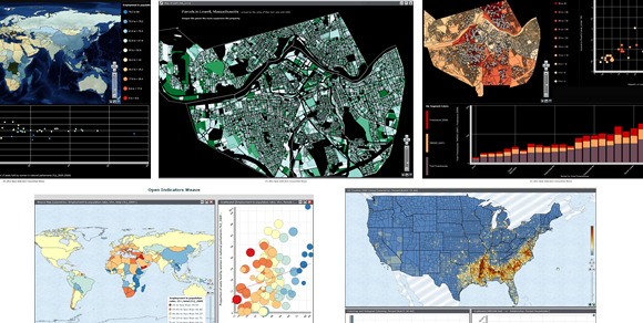
Whenever I write about data visualization or infographics, I always receive a few comments asking for suggestions of good visualization tools. We all know that finding good tools isn’t always easy. The trouble I find with data visualization tools in particular is that most have long been only available to the tech savvy. However, two Boston-area organizations are setting out to change that with Weave.
Developed by the Institute for Visualization and Perception Research of the University of Massachusetts Lowell and by the Open Indicators Consortium, Weave brings forth a powerful and easy-to-use, free tool “for anyone interested in a topic to explore and [wants] to analyze information about it, instead of leaving the task solely to computer and data specialists”. (ComputerWorld) With Weave you’ll be able to engage “the public in a dialog with the data…That’s why Weave is open source and free” says Weave project head, Georges G. Grinstein.
However one of the issues inherent with any early-stage open-source software is the limited formal training options for staff and product features. You’d think such a new tool would have a pretty slim list of features – not so. “one of the challenges of implementing Weave was how to narrow down its offerings so that end users wouldn’t be overwhelmed with options”, says Holly St. Clair, data services director at the Metropolitan Area Planning Council. (ComputerWorld) Despite only being around for three years, the developers of Weave have created a powerful feature-rich application. Still concerned about the lack of training? Many believe that as adoption increases, so too will the availability of training.
Currently there are about 25 organizations using Weave and giving feedback – including 10 that have been with Weave since the beginning. About 25 to 30 students have worked on Weave in its first three years at UMass-Lowell. Their work is expected to continue for an additional three years giving the team time to incorporate various new features asked for by the Weave community. Several of these powerful features have already been crafted and are awaiting user-interface design including a collaboration and a sessions-capture feature, both expected to be released this summer.
The Collaboration feature will allow people in multiple locations to work on visualizations together in real-time, without needing a screen-sharing application like WebEx or GoToMeeting. While admittedly Weave is currently somewhat difficult to install, there are plans to add a lighter one-click installer by this summer.
Also on the way are so-called “infomaps”, one of the patented technologies within Weave. These infomaps can tie a visualization to a collection of documents, very similar to the National Science Foundation’s Action Science Explorer (ASE) – curious about the ASE? Check out my previous post. Weave’s infomaps ties a body of documents to a physical map. If a user wants to retrieve documents about Andover or that mention Andover, all they have to do is click on Andover in the Weave created map and they’ll be able to access the documents they’ve been looking for. Think of it as Google Maps tied to a body of documents that offers multi-visualization interactivity.
Want to Give Weave a Try?
Sparked your interest and want to give Weave a try? Well, just visit Weave’s site and you can get install it from there.
Hopefully this is the beginning of making data visualization tools easy to use and more accessible to all.

