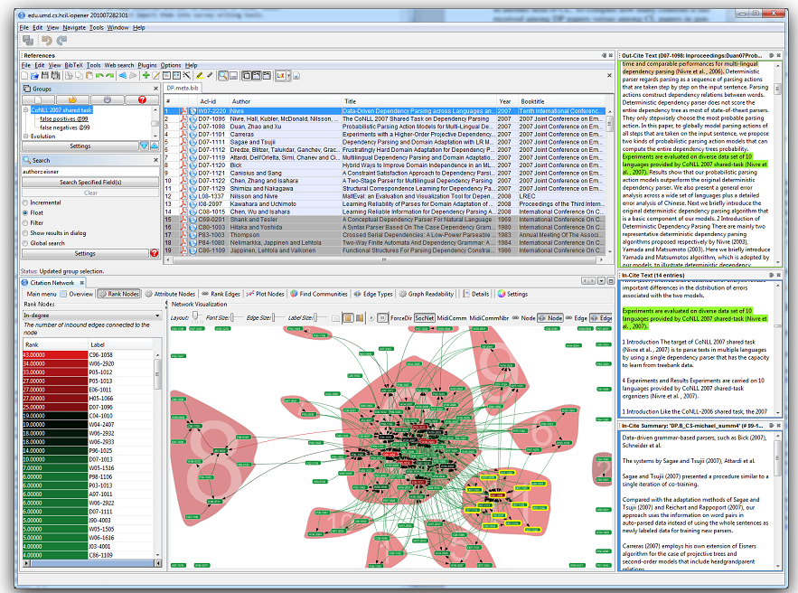
Ever been asked to find a specific file for someone and just plain can’t or it takes a good ten minutes to find it? Sure. We’ve all been there before. Interestingly enough, scientists could be changing that. Recently I came across this cool article from the National Science Foundation (NSF), talking about how scientists are now using a cool tool that helps them visually organize related documents. So, I thought to myself “Wow, kinda cool.”
The National Science Foundation created a tool, the Action Science Explorer (ASE), which allows scientists to generate easily-consumable documents that are related to specific subject areas. Ok, so maybe not the sexiest thing in the world, but what I found particularly cool was that it uses a visual framework. The way ASE displays related documents is via this node system – in which similar documents are clustered together and are given the same color. By using such a format, ASE cuts down time spend on searching for important documents thereby allowing scientists more time to spend researching.

I think this example helps illustrate the benefit and power of organizing data visually. In an era where we are exposed to more information than ever before, organizing it to be able to easily find what you need is becoming more and more important. The cool thing about structuring and storing data in this manner is that it not only cuts down time spent searching for important documents, but it also encourages new collaborations among groups that unknowingly are working on similar topics which could accelerate results.
Visual Data Organization: 1 Traditional Linear File Organization: 0
I think that it’s great that we’re seeing the development of software tools that stress visual representation. It’s the next logical progression in the evolution of software. So I’d like to pose a question to you, if visual organization is good enough for scientists don’t you think it’s time to start taking advantage of it yourself?

