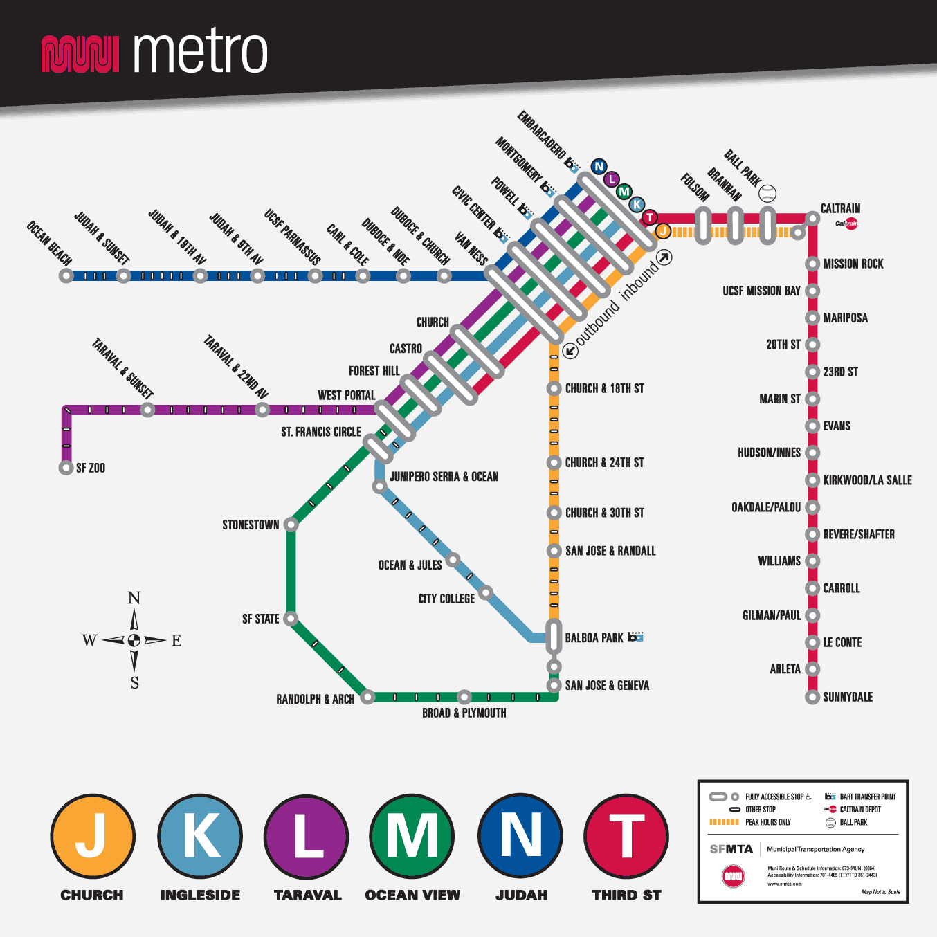
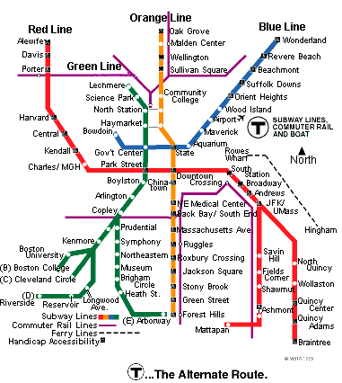
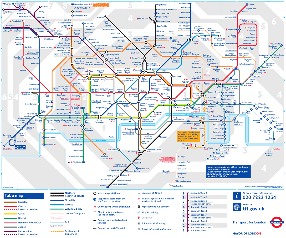
The ability to transform complex data sets into clear and engaging graphics is a sought-after skill in the information economy. And as regular readers of this blog are well aware, there is no shortage of data visualization resources online and off, including classes, blogs, books and TED talks. But learning the fundamentals of effective visualization doesn’t require a course certification—only a subway pass.
Would-be graphic designers and infographic architects would be well served spending an afternoon on the Muni (or the Metro, or the Tube, or the ‘L’) and studying the challenge of effectively directing riders to their desired location. Well-designed public transit system maps are a perfect blueprint for matching form to function. Subway riders—especially tourists!—want to know not only where they’re going, but where their stop is in relation to landmarks on the surface. A purely proportional geographic map would solve this problem, while creating another—a tangle of turns and angles that would only make a trip from A to B more confusing. A purely schematic map employs a much cleaner design, but even locals can become frustrated by its topographical liberties.
Modern transit maps represent a refined middle ground. Stripped down to the bare essentials, these mostly-diagrammatic maps convey layers of information on a two-dimensional surface. The design has been carefully calibrated for good reason: some researchers believe that the way a transit line is represented on a map can influence riders’ behavior. If a certain line is too crowded, the transit authority might simply stretch the line out on the map, making the trip appear longer—and thus less attractive to riders. This simple illusion of design serves to reduce overcrowding and increase transit efficiency.
Here we present a few other lessons for infographics conceptualization and design derived from some of the best transit maps.
Color
Look at a transit map for any major metropolitan area, and the woven net of blue and red and green lines might evoke the word “colorful.” But look a bit closer, and you’ll find that the use of color on these maps is spartan, reserved for only the most essential items. The color isn’t there to make the image more aesthetically pleasing; it is there to do a job—in this case, color-coding the various subway, tram, or bus lines that criss-cross the city. By laying this net across a spartan background, the importance of the information encoded by the colors is allowed to become a key point of information in and of itself.
The lesson: When adding color to your visualizations, ask yourself what function the colors are serving, and pare away colors that aren’t doing any work.
Iconicity
Iconicity is key in the process of translating complex information into a form that can be understood quickly and easily. Think of it as form meeting function. With the overwhelming amount of data presented on transit maps, it’s important to make sure that everything is represented as simply and concretely as possible. Handicapped-accessible stations are marked with blue wheelchairs. Transfers to other lines are represented as two joined nodes, or brief overlaps between the two lines. In London, stations which are also serviced by overland trains are marked with the National Rail logo. There are no wordy descriptions about transfer options or the presence of elevators at a given station; the information is simply there, available at a glance.
The lesson: Rely on commonly understood logos and images to simplify and improve communication.
Branding
Although not directly related to the issue of the maps themselves, the branding put in place by various transit authorities warrants mention. The logo of the London Underground — along with other transit logos, such as Boston’s iconic “T” — have become synonymous with their cities. What’s more, these logos serve as a daily point of reference for commuters and travellers throughout the city, the marker of a trusted route to work or home, and an ever-present part of the fabric of the city.
The lesson: Consistency and regularity across visualizations—which is to say, branding—creates a sense of familiarity in those interacting with your data.
Don’t Overwhelm
In a recent study on viewer perceptions of data visualizations, researchers found that people prefer representations which they described as “organic,” “organized,” and “simple.” In transit maps, meeting the goal of “simple” often results in abstraction. For example, the exact physical relationship between stations is less important than accurately representing which stations allow transfers to other lines. And on the London Underground map, the snaking path of the River Thames through the city is reduced to a simple blue line — just enough to provide a context for which side of the river a station is on, but no more.
The lesson: Decide what information is absolutely critical to the story that your visualization should tell, and jettison everything else; any extra data will only distract from your message.
These tips may help you help you find a middle ground between incorporating as much information as possible into your graphics and employing an economical aesthetic. Every designer wants their work to be noticed, but remember this: when a map works well, it requires only a minimal amount of your attention. But when a map is confusing, misleading or inaccurate, you’ll spend minutes tilting your head back and forth trying to interpret its cryptic symbols and convoluted routes. Let your design speak for itself with a clear, concise voice.


