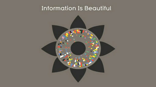
Happy Friday everyone! So, the other week I was asked to help identify trends in our company’s social media data. That got me thinking, if there was a way to visually see all this data, I bet it would take less time to come to my conclusion. I’ve read a lot on and blogged about the importance of data visualization here on Conspi.re and figured it was about time to put this to work.
Data Visualization Works
In a previous post, I mentioned how the brain is wired to recognize images far faster and easier than text – there’s a reason why flashcards work so well. The truth is we are naturally drawn to images. This is why if done well; data visualization can be such a powerful tool. In the spirit of data visualization I wanted to share this TED Talk by David McCandless.
In this talk, highlights of the power and beauty of data visualization. From seeing national budgets, to military sizes to media fears David walks you through how he created his killer graphics and how much insight you can pull out of them. Personally, I found his lecture extremely interesting, entertaining and educational. For example, did you know that you’re only aware of a very small percentage of what you actually see? Pretty cool. So, check it out, I’m sure you’ll be impressed. It may even inspire you to try to visualize some data sets that you’re currently working on.
Your Turn
Are you a designer, have any data visualization tips?
Not a designer? No worries, we’d still love to hear your tips too!

