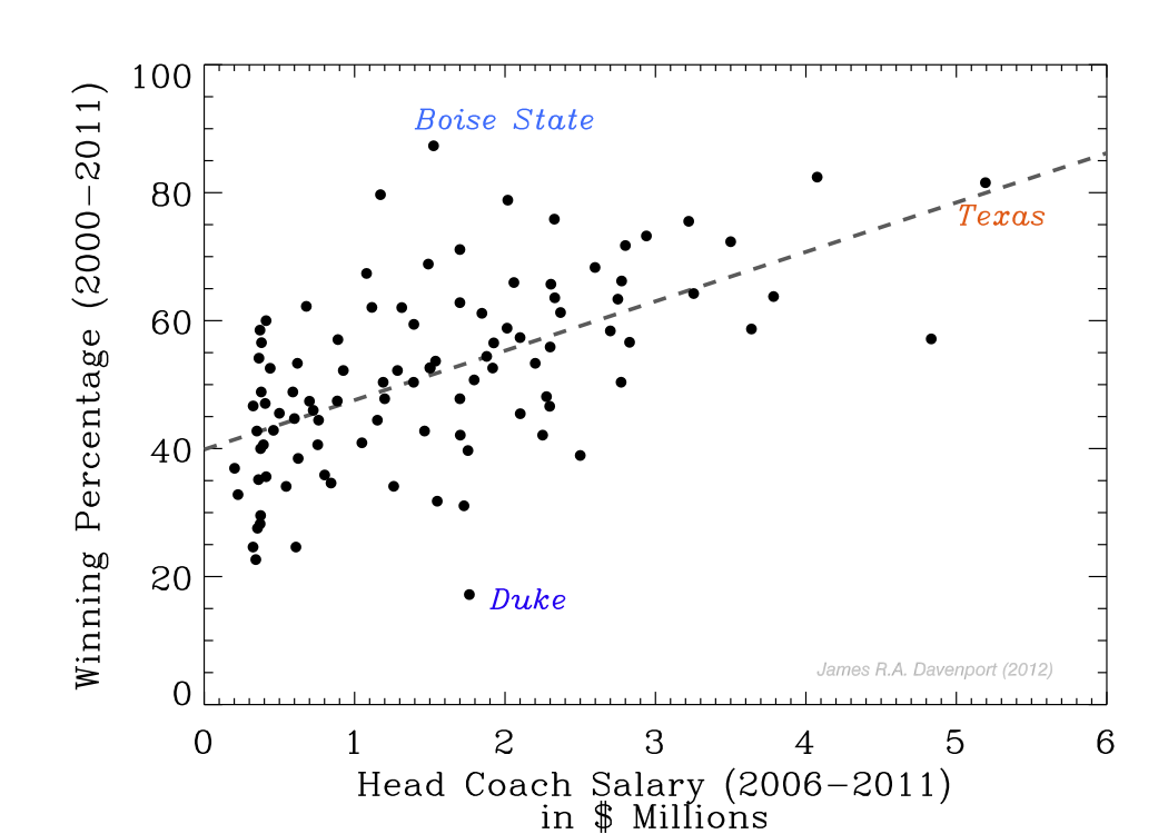
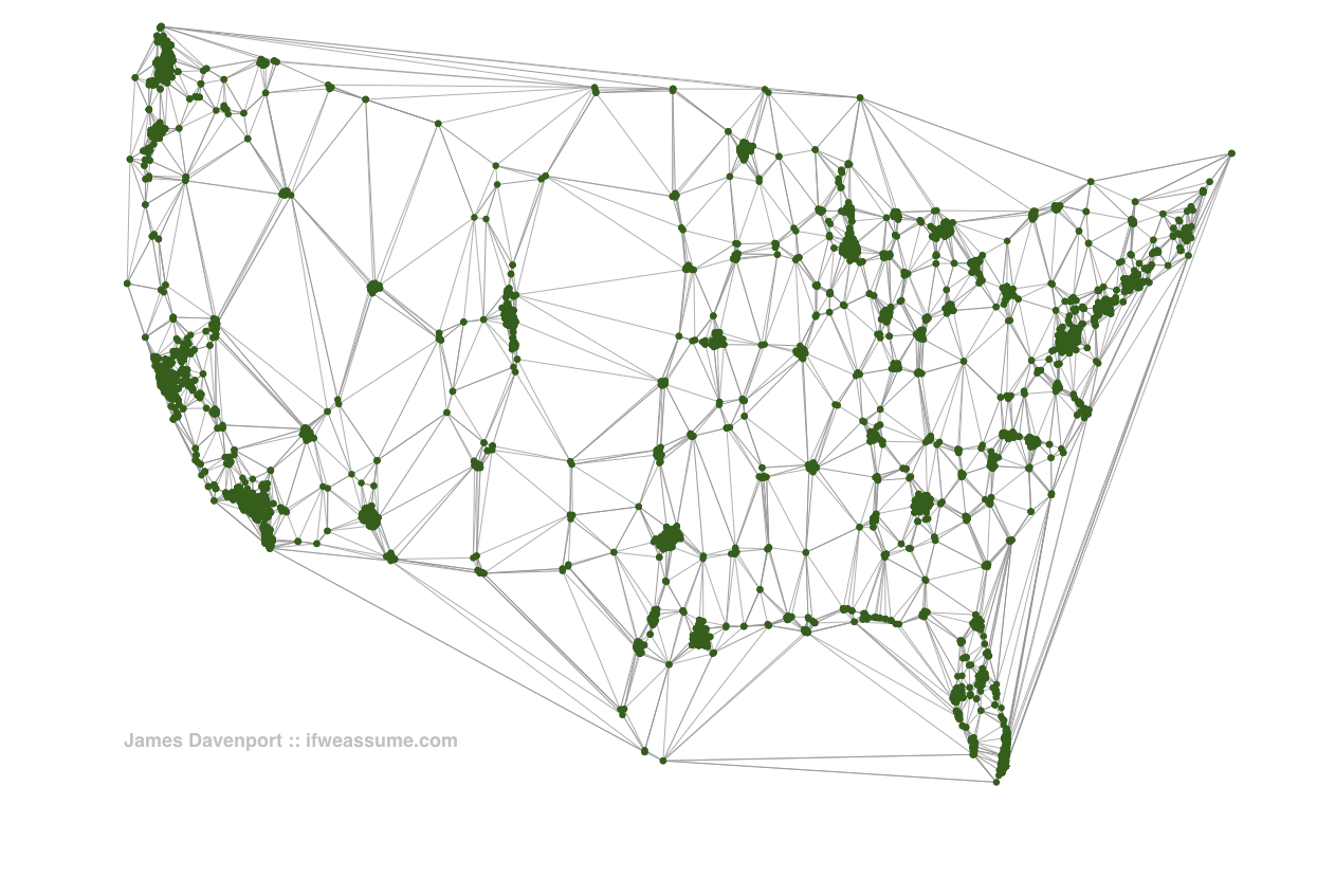
James Davenport is an astronomy PhD candidate at the University of Washington whose research focuses on the evolution and destruction of open clusters of stars. But when he’s not looking at the heavens, Davenport enjoys analyzing and compiling visuals of a more terrestrial nature. His blog, If We Assume, spotlights data-driven graphics on topics both celestial and mundane. The site’s best ongoing feature is Davenport’s efforts to answer self-posed “ridiculous questions” with statistical analysis and visualizations. If you ever wanted to see a comparison of college football head coach salaries vs. win ratios or a Delaunay triangulation of Starbucks across the contiguous United States, you should bookmark If We Assume. Davenport is smack-dab in the middle of grant proposal season (yes, he has graphics on that as well), but he took some time from his busy schedule to discuss the origins of the blog, astronomy’s influence on visualization techniques, and the appeal of binary stars. His answers have been edited for space and clarity.
MJ: What was the genesis of If We Assume? Why did you start the project?
Davenport: The phrase “If we assume” is one that we use a lot in physics and astronomy. Many of the problems we tackle are so complicated, or have so little data on them, that we need to make intelligent assumptions. This often results in answers that are correct to within an “order of magnitude” (aka a power of 10). I found this system of logic both powerful and exciting! With some honest and educated assumptions, we can begin to answer seemingly intractable problems!
The genesis of the blog was my desire to learn new visualization/communication techniques and software, and to practice doing interesting problems. All of the analysis skills I use on If We Assume come directly from my experiences on research projects in astronomy. It’s great fun to apply some of the reasoning and modeling we use in research towards fun or quirky everyday kinds of problems.

MJ: Some popular graphics on your site include a depiction of Starbucks locations and an analysis of NCAA football coaching salaries. How does this relate to your astronomy work?
Davenport: For my blog I tackle problems that have a more “everyday” basis. I try to pick topics that relate to me and my life (e.g. coffee, grant funding, voting, sports). What makes it fun is to ask questions that require looking at data in unique ways, or to pick interesting different sources of data to compare. Just like in astronomy, where we look for subtle trends in massive amounts of data to determine the history of a particular stellar population, in my blog I try to look for fun or creative results hidden in “boring” tables of data.

MJ: How is a visual depiction of Starbucks locations useful?
Davenport: Oh, some of it is just plain silly. I don’t suspect anyone will decide to not vote based on my analysis of the Washington state voter turnout records.
Some of it tells a neat story. People should understand how science is done, how business analytics work. Math is not magic, and it belongs to mankind! I’d like to believe that by using science skills to discuss everyday kinds of data/questions I’m starting conversations about our data-driven world. Sort of like data-journalism, I suppose.
MJ: Do you have a favorite area of visual analysis other than star clusters?
Davenport: Another awesome subject in astronomy for data [visualization] is binary stars. These are systems of two stars that are orbiting each other. The orbital periods range from hours to thousands of years. The short period ones are fun to study because they can undergo full orbits in a single night of observation!
Outside of astronomy, I really like maps. They’re the most commonly understood type of data visualization, and when you combine them with other data (e.g. demographics, temperature, time, political boundaries, military campaigns) they tell an intuitive and amazing story. If only everyone got as excited about histograms or contour plots!
On the other end of the spectrum, I loathe pie charts.
MJ: Is there anything you think I’m missing? Anything you’d like to add?
Davenport: I’m really excited that the field of “data scientist” is blowing up, especially this year (though I think the name is a misnomer). Lots of big companies are hiring people to tell stories with their data, and while this may be a fad with a short lifespan (e.g. OKtrends), I think it represents a logical progression of our society’s increasing technical understanding.
To wit, everyone has a mobile phone in their pocket, which has a few simple graphs constantly displayed: reception and charge. There’s a reason major mobile carriers have been advertising with fancy maps of cell coverage. People love data!

