By: Emily Finlay
Data has become essential to every job, business, and industry. Just because you can track your numbers, however, doesn’t necessarily mean you can apply them in any useful way. Data visualization is a tool that transforms this raw information into knowledge. Creating visual representations of your data helps everyone understand the relationships and patterns they might not see otherwise. Rather than relying solely on analysts, you can use this tool to make informed decisions that are backed by solid data.
Since there are endless ways to analyze and apply your data, there are also numerous types of data visualizations. Choosing the right option ensures you find the information you’re looking for. It also displays the data in the most relevant form.
In this guide, discover the most commonly used types of data visualizations, how you can use them, and which business needs they serve best.
5 most popular types of data visualization
1. Column charts
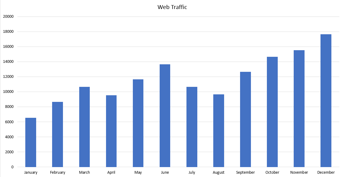
As one of the easiest techniques to use and understand, column charts have also become the most popular option for data visualization. Also known as column graphs, this tool is typically taught as early as grade school to help students learn to understand and analyze data. They are most often used to show and compare how many of the subject is present in each group.
Data visualization techniques: Column charts
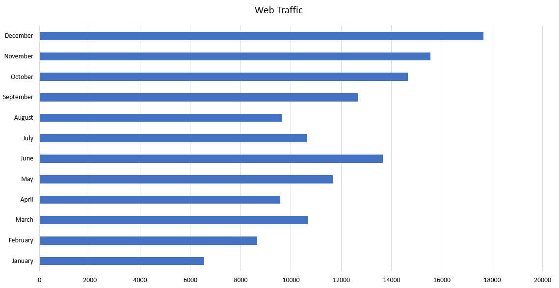
A column chart consists of horizontal or vertical columns that represent each set of data. They are displayed on a graph that shows an x- and y-axis. Typically, you use vertical bars along the x-axis to show the data and a numbered scale along the y-axis to show the measurements involved. That said, you can also switch the axes to use horizontal bars, creating a variation of this type known as a bar chart or graph.
If you are comparing multiple sets of data, you can also stack columns, as seen below. If you were tracking the frequency of an event across every day of the week and also comparing the occurrences by night and day, for example, you could use this technique.
Data visualization best practices: Column charts
When using a bar graph, it’s important to either label or color each set of data to set them apart. You should also choose a numbered scale that is as close as possible to the lowest and highest numbers in your data set. Rather than going from 0-100 when your highest number is 53, you can cap it at 55 to more clearly display each result.
Data visualization examples: Column charts
These charts are a great way to view the differences between sets of data or how one set of data changes over time.
You could, for example, use a column chart to see which of your products are selling best and which are selling the least. Or, you could use it to see how many sales you made per month. Other uses include tracking website visitors, evaluating your audience by age, and planning future supply orders.
2. Line graphs
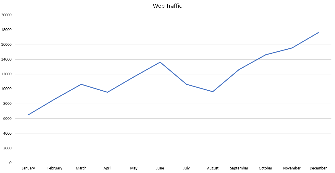
One of the next most popular types of data visualization, line graphs are simple and beneficial for a broad range of data needs. These graphs are often used to show changes over time, particularly those projected for the future. If the lines go up, the numbers increase. If it slopes down, you’re experiencing a decline. This simplicity makes line graphs a top choice for almost any situation.
Data visualization techniques: Line graphs
Like column charts, line graphs are displayed on an x-axis, showing the time range, and y-axis, for the measurements you’re tracking. Represent each data set with a solid line, rather than a dashed or dotted line, for clarity. Every graph should also use a legend or labels to identify each line.
Data visualization best practices: Line graphs
Along with using solid lines, you can also use different colors for each data set to differentiate between them more easily. You will clarify these identifiers in the legend. Choosing a measurement range that keeps the end-point of the highest line a bit below the highest measurement will keep your chart looking clean. Most importantly, limit your charts to four lines or less to avoid confusing viewers.
Data visualization examples: Line graphs
Line graphs easily show how any changes progress over time. From hours worked to costs to revenue, you can understand how your company’s current status compares to months or years previous. You can also use this tool to view your anticipated future results, using data projections to plan future moves.
3. Matrix diagrams
When you want to understand the relationship between different sets of data, a matrix diagram is your answer. A matrix diagram compares groups of data within a larger category of information. This type of data visualization shows how these groups interact with and influence each other. With this clear visual representation, you can make more effective decisions.
Data visualization techniques: Matrix diagrams
First, you have to choose which of the five types of matrix diagram you want to use:
- L-shaped: Comparing two groups or one to itself
- Y-shaped: Comparing three closely related groups
- C-shaped: Comparing three groups at the same time
- T-shaped: Comparing two closely related groups
- X-shaped: Comparing four groups
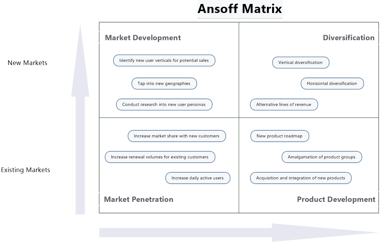
MindManager, for example, is well equipped to create X-shaped matrices. This type of data visualization requires a time investment, but it’s well worth it for the detailed insights you gain.
Here’s an example of an Ansoff matrix diagram created in MindManager using the X-shaped technique.
Data visualization best practices: Matrix diagrams
Before starting your diagram, decide how you will compare the relationships you’re reviewing. To avoid confusion, you also need to assign a symbol to each data group to keep track of the right numbers in the matrix.
Data visualization examples: Matrix diagrams
This tool is ideal for determining causation. You can identify the root of problems, weigh multiple solutions, and see how well your teams are meeting requirements. Examining data in a matrix diagram can also help you find opportunities to improve your operations.
4. Scatter plot charts
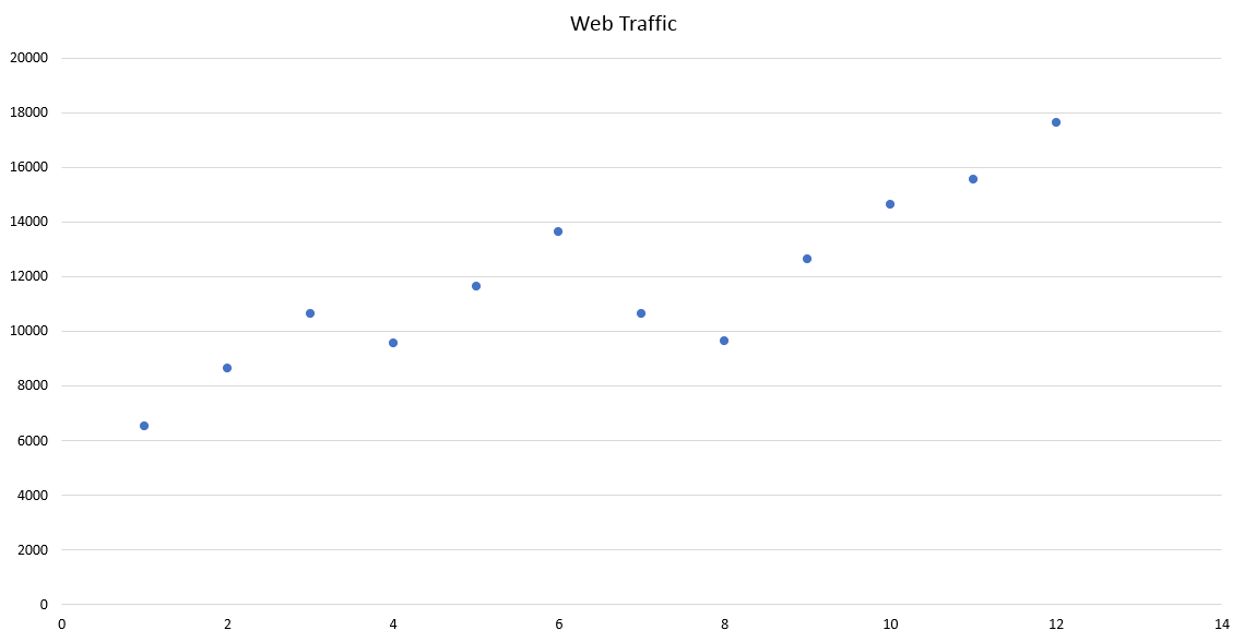
Scatter plot charts, also known as scattergrams, are used to find relationships between variables using a large number of varied data points. Displayed on an x- and y-axis, this chart shows similarities between points while also highlighting any outliers. Analyzing how your variables relate to others can help you spot trends within your information.
Data visualization techniques: Scatter plot charts
To work, you need several data points for each variable. Once you’ve plotted your data, you must then analyze the correlations you see. If the data trends upward from left to right, for instance, you probably have a positive relationship between variables. Or, if you can’t see a consistent pattern, you may not have a correlation at all.
Data visualization best practices: Scatter plot charts
The purpose of a scatter plot is to show “when x equals this, then y equals that.” For best results, choose variables that have a strong chance of affecting each other. It’s also important to remember that trends don’t automatically equal causation. If you see a pattern, continue investigating this relationship to see if there is another variable that may be affecting this data.
Data visualization examples: Scatter plot charts
Since these charts are used to identify correlations, you can use them to investigate any problem. Let’s say you run a delivery company and want to know if time of day affects delivery times. You could run a scatter plot chart comparing how long it takes to make a delivery at each hour throughout the day. With this visualization, you can spot any trends that might be affecting your drivers’ efficiency.
5. Pie charts
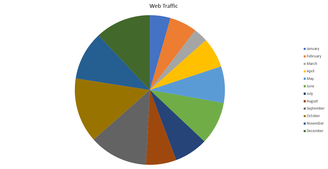
Few people are unfamiliar with pie charts, which makes it a great option to use when sharing information with a large group of people. A pie chart looks like a circle with multiple “slices” cut in various sizes. Used to show how the main information you’re examining is made up of various percentages, this tool shows how every part of your data compares to the others.
Data visualization techniques: Pie charts
The only way you can use a pie chart to display information is if your data is broken into percentages of a larger whole. Rather than using this way of visualizing data to understand deep insights, pie charts give you at-a-glance information about the subject.
First, make sure your data percentages add up to 100%. Then, be sure to clearly label each segment with the percentage and numerical amount to help your audience understand the breakdown.
Data visualization best practices: Pie charts
In addition to labeling, assign a different color to each slice to differentiate them. Organizing the slices by size is easier to understand both visually and mentally. Most importantly, limit the number of pieces your chart will include. If you have to break your data into more than four or five slices, you should probably choose another type of data visualization.
Data visualization examples: Pie charts
You can use pie charts to understand how you’re allocating resources or who makes up the largest part of your audience. With this type of information, you can adjust your processes to find greater efficiency.

