In this era of “Big Data,” businesses rely on the accumulation and analysis of raw data to help them understand an uncertain environment. Yet the sheer quantity of available information can overwhelm even the most sophisticated data miner. The problem of transforming spools of statistics into decipherable figures is one all too familiar to the world of science. Scientists deal with not only big numbers, but big concepts that require complex modeling and high levels of abstraction.
The International Science & Engineering Visualization Challenge, created by the National Science Foundation and the journal Science, is an effort to recognize scientific researchers who use visualization to communicate their findings in ways that are accessible to the general public. Since 2003, awards have been handed out annually in a variety of categories, from Photography to Illustrations to Informational Graphics.
With the parallels between science and business in mind, let’s consider some past winners of the challenge and identify how these particular visualizations effectively distill data into an engaging and informative piece of art.
Rethink your numbers
Traditionally, we represent numbers in straightforward ways—charts, graphs, simple ratios. But sometimes the big picture is more significant than highlighting disaggregated data points. “Everyone Ever in the World” by Peter Crnokrak, which received an honorable mention in the Informational Graphics category in 2010, exemplifies this wideframe approach.
Using the surface of the paper itself, Crnokrak represents everyone who has lived from 3200 BCE to 2009 CE. In the center of the image is a large hole, representing the 1.25% of the total population who have died in a major war or conflict, while the intact remainder of the page represents those lucky enough to have lived out their lives in relative peace. Although the image includes the numbers that Crnokrak used to calculate the percentage, the message of the image would be effectively conveyed even without them.

A similar approach is evident in The Cosmic Web (above), the 2011 winner for Informational Graphic by Miguel Angel Aragon-Calvo and his team. The image represents a single chunk of space some 240 million light years in size. Starting on the left with the massive, underdense void and the macrostructures that make up the universe, the image “zooms in” as it moves to the right, ending on the scale of individual galaxies. Project lead Aragon-Calvo notes the image “highlight[s] the underlying ‘order’ that can be seen at all scales.” The statistics supporting The Cosmic Web are based on complex calculations, but the image itself is elegantly simple.
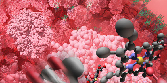
Merge your data with art
Some science visualizations may depict the unappreciated beauty of a particular field of research rather than specific data. Consider “Mad Hatter’s Tea” From Alice’s Adventures in a Microscopic Wonderland, the 2008 winner in the Informational Graphics category. Created by Colleen Champ and Dennis Kunkel of Concise Image Studios, the image is a hodge-podge of microscopic photographs that have been edited together into the classic scene from Alice in Wonderland. The Mad Hatter, the March Hare, and the Dormouse are played by beetles. They sit on a lawn of vitamin C, and rest their cups and saucers on a table of butterfly wing. The scene sings with the false fluorescence of micrographs, a fitting counterpoint to the Alice in Wonderland inspired imagery.
There’s no “data” here, but there’s plenty of science. The still beauty of the tiny images conveys a sense of the continued progress of science to uncover the secrets of our world, the zeitgeist of a field.
")
Change your perspective
What’s the tallest mountain on Earth? Everest, of course—every school child knows that. But what if we measured mountains not from sea level, but from the crust they stand on? What would hold the title of highest mountain then?
Perhaps surprisingly, the answer to that question is the “big island” of Hawai‘i, a fact made clear by the 2006 winner in the Informational Graphics category Hawai‘i — The Highest Mountain on Earth (above) by geographer Nils Sparwasser and his team at the German Aerospace Center. By making the surrounding seawater transparent in their visualization, the Hawai‘ian Islands become the tallest peaks of a massive mountain chain that stretches northwest towards the Russian shore.

A literal change in perspective can likewise provide a unique way of looking at the world. Consider Zoom into the Human Bloodstream (above), the 2008 winner in the Illustration category. Borrowing a trick of perspective from landscape painting where larger, more distant objects can be represented as roughly the same size as smaller, closer ones, Linda Nye and her team at the Exploratorium Visualization Laboratory were able to provide a picture of the human circulatory system that goes beyond the usual diagram of a heart and its myriad connected vessels.
At the bottom of the image—and thus the closest and smallest—is an oxygen molecule. As we move up the image, we pass ever-larger structures, from the hemoglobin molecules that bind oxygen to our blood to other denizens of our circulatory system, such as cholesterol and blood platelets, which are shown alongside an even-larger red blood cell. Finally, we reach the heart, portrayed in muted colors and included as if an afterthought, the distant mast of a ship on the horizon.
A simple change in perspective, whether it comes from removing an ocean or starting from the tiniest component of a system, can provide a completely revamped way of conceptualizing information.
From Depiction to Discovery
In addition to representing information in an easy-to-understand way, visualization can also serve as a way to generate new ideas.
“By using visualization we tap into our brain’s ability to identify patterns and relations,” says 2011 Informational Graphics winner Aragon-Calvo. “Traditionally we have used visualization to present the results of our analysis. Now we are starting to see visualization applied to data exploration and it is driving new discoveries. Some of the best ideas I have had came as a direct result of visualization.”
The moral in all of this? Let visualization guide your attempts to conceptualize data. That might mean jettisoning specific numbers in favor of the big picture, or radically changing your perspective to view a problem in a new way. But in the end, you’ll understand your data better. And you might even generate a new idea or two in the process.