An article by: Dr. Steven Bashford, Director of Technical Services EMEA, Corel GmbH, Division Mindjet
In Part 2 we discuss how processing linked data visually helps us to get a better overall view without losing sight of details (holistic view), as reflected in the saying “a picture is worth a thousand words.”
You’ll find the other chapters on “The Power of Visualization in the Digital World” here:
Processing linked data visually?
It is crucial to represent data visually to understand it better. Visualization offers major benefits, including a better overall view, faster and long-lasting comprehension, as well as insights into the correlations and more transparency in communications. MindManager has its roots in the Mind Mapping method and was the first software to support this method in 1994. The Mind Mapping method had (and has) the advantage of being able to represent knowledge in a very intuitive way, readily understandable by everyone.
It quickly became clear that the benefits of the method come into effect in many business applications, but that the method needed to be expanded to be used in real scenarios. The method was continually developed to a greatly expanded form of traditional mind mapping—Business Mapping. It was necessary to extend the topics of a map to represent certain content with greater precision.
This included extensions with:
- Task information (such as status, start and end date, effort, resources etc.) and task dependencies
- Symbol and text-based markers to qualify and categorize topics
- Hyperlinks to reference external documents, websites and attachments
- Topic properties and calculations to capture and calculate key figures, structured data and data types
- Integrations with Microsoft Office
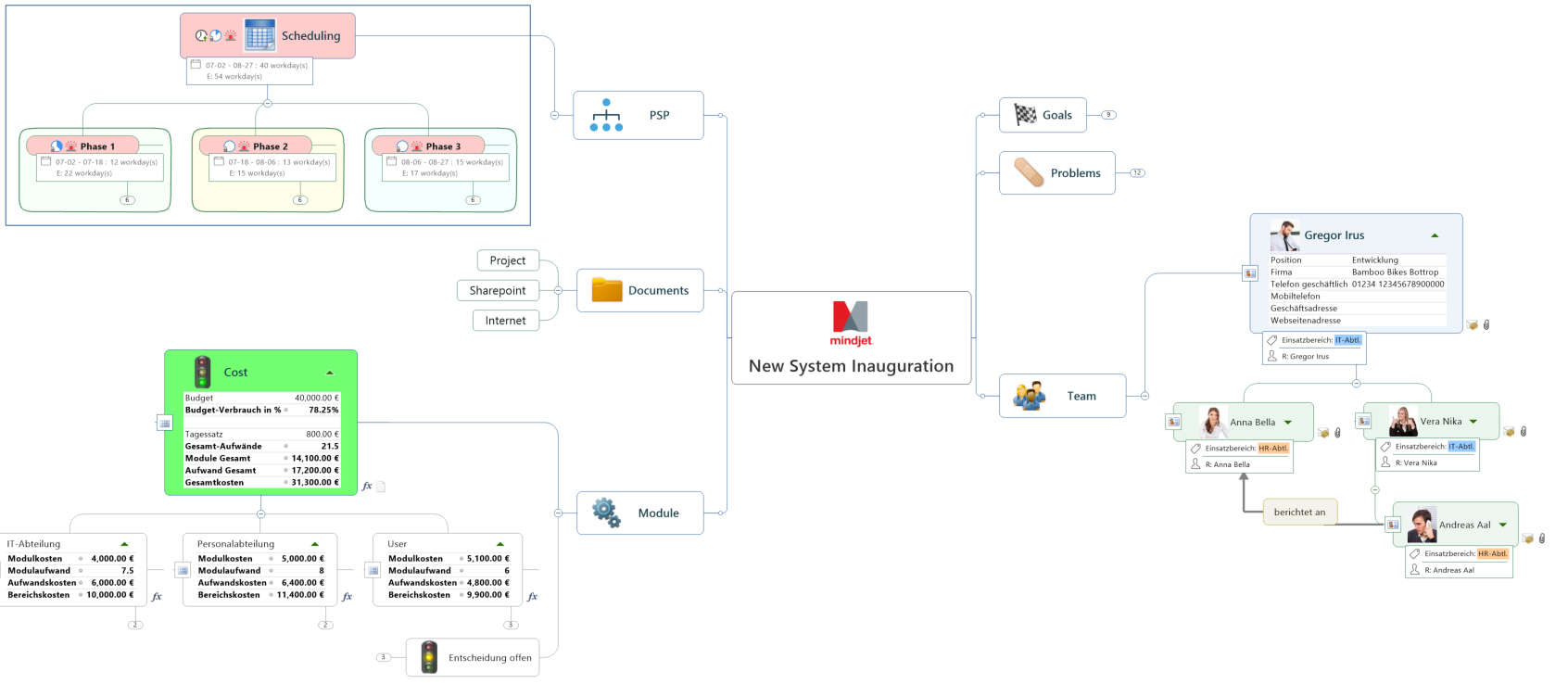
Layout extensions, such as org-charts, tree and timeline layouts, and a more formal look of maps played a major role in the acceptance of MindManager within business applications. What is important here is that the hierarchical structure was still the sole basis of visualization in all these extensions.
All in all, these extensions provide support for application scenarios such as task and project management, strategic and budget planning, risk management and many more.
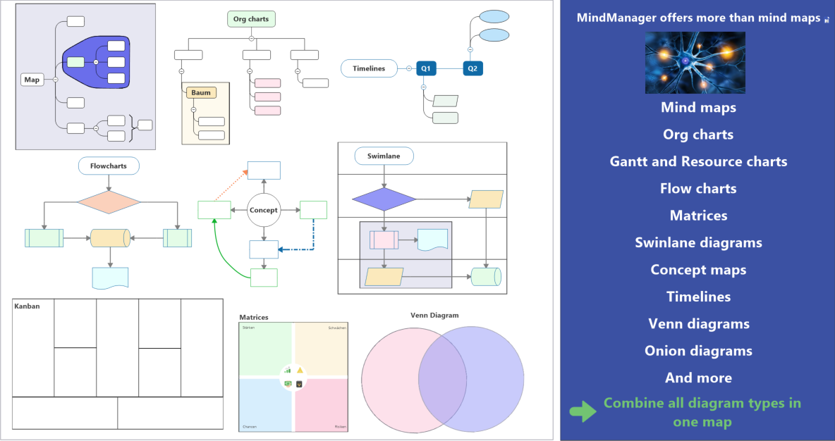
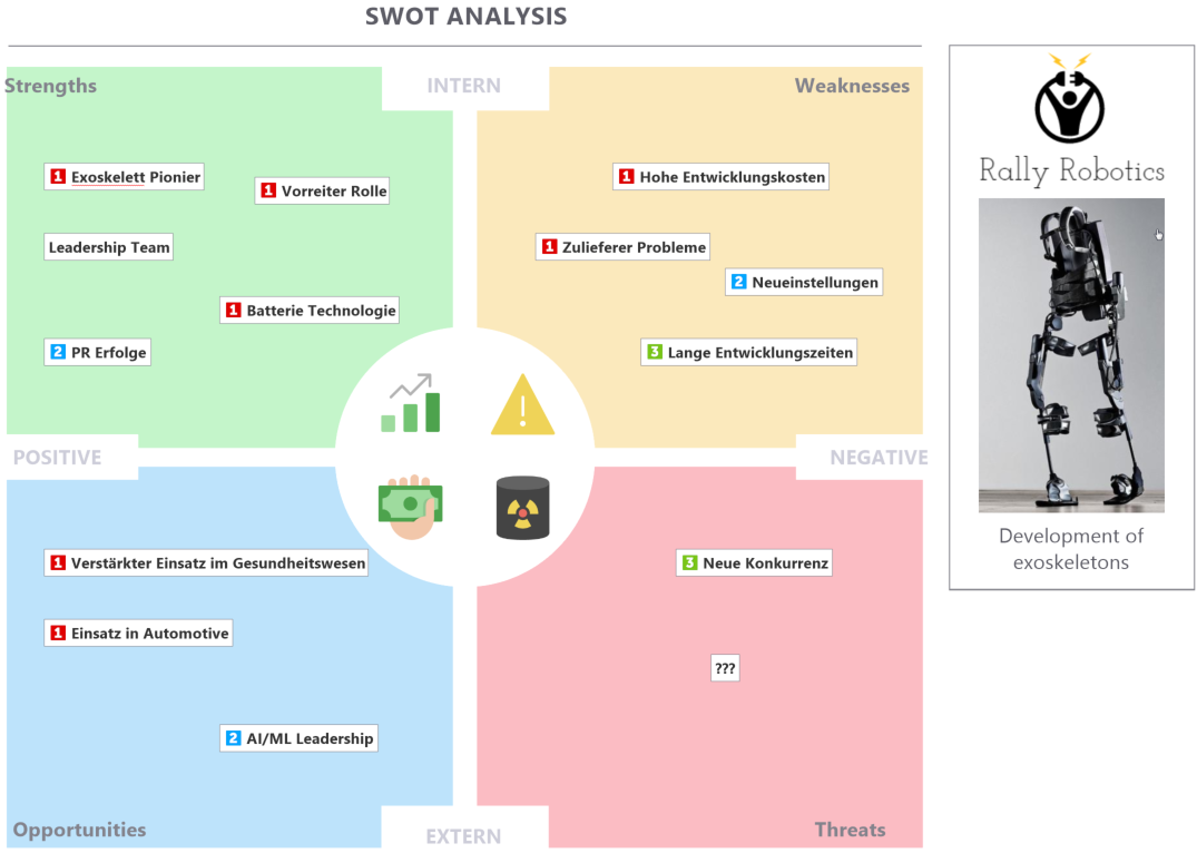
In response to increased customer requests for further visualization capabilities—as mind maps do not always offer the best visual representation for certain data or information—MindManager now includes a wide range of other diagram types. On the one hand, flowcharts and swimlane diagrams that usually are better suited to represent process flows. On the other hand, concept maps that allow for an elegant and simple modelling of knowledge content that represents relationships. And MindManager 2018 for Windows introduced new background objects that make it possible to create a variety of new diagrams, including 2 x 2 matrices (see figure 2) and Venn diagrams.
In all diagram types, it is key that you can utilize extensions such as topic properties, task information and other capabilities that we will discuss later. This does not just create mere visualizations or static images, but living documents in which you can work efficiently with data.
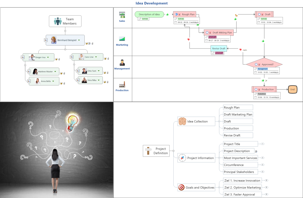
Furthermore, you can combine all data types, allowing you to always use the most suitable visualization for your content. As a result, you can often develop significantly more compact and clearer representations of data, projects and processes (see Figure 3).
Importantly, the added top properties and calculations are some of the specific features that play a central role in visualizing and analyzing big data. Figure 4 shows an example of a machine description of a robot. The description includes all components and sub-components (and sub-sub-components) with possible errors and their causes. Topic properties were used to describe the component details. The errors include risk assessments, risk costs and frequencies of occurrence in form of topic properties that allow for calculations.
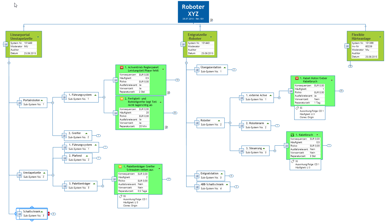
You can now automatically highlight selective key figures and filter them by important areas with the tools we will present in the next section. Furthermore, by expanding and collapsing topic structures you can accurately define the level of detail you want to see and compare different areas of the maps. In formats such as Word and Excel, this is only possible to a limited extent. The visual format quickly identifies and highlights structural relationships.
Even though this map was created manually, it is possible to enter key figures such as frequencies or risk values from a database, or even to automatically create large parts of the machine description (for more information about these capabilities, please refer to the ‘Integrations’ chapter). This would be especially important if the key figures change in the course of time based on newly generated data material. Thus, the data would be updated accordingly, and new critical areas would automatically be highlighted based on the tools we will discuss in the following chapter.
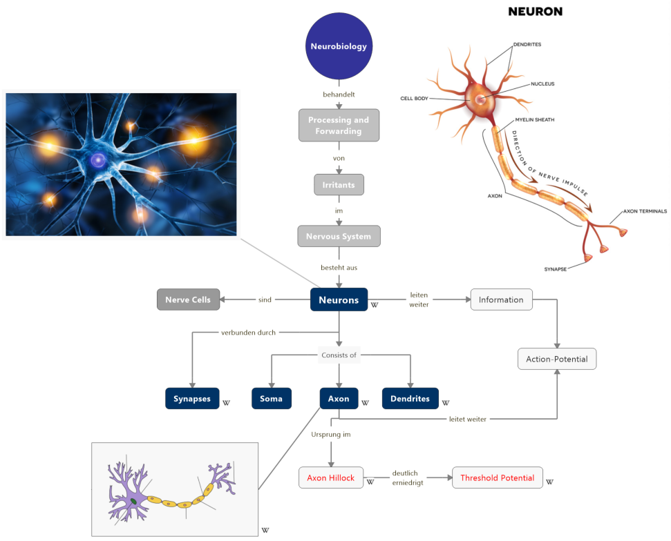
Here are two more examples (impressions): a concept map (Figure 5) and a project management process (Figure 6). The project management process is a combination of a timeline map and a swimlane diagram. In addition, it contains topic properties for budget and actual costs and a corresponding calculation for totals formation in parent topics.
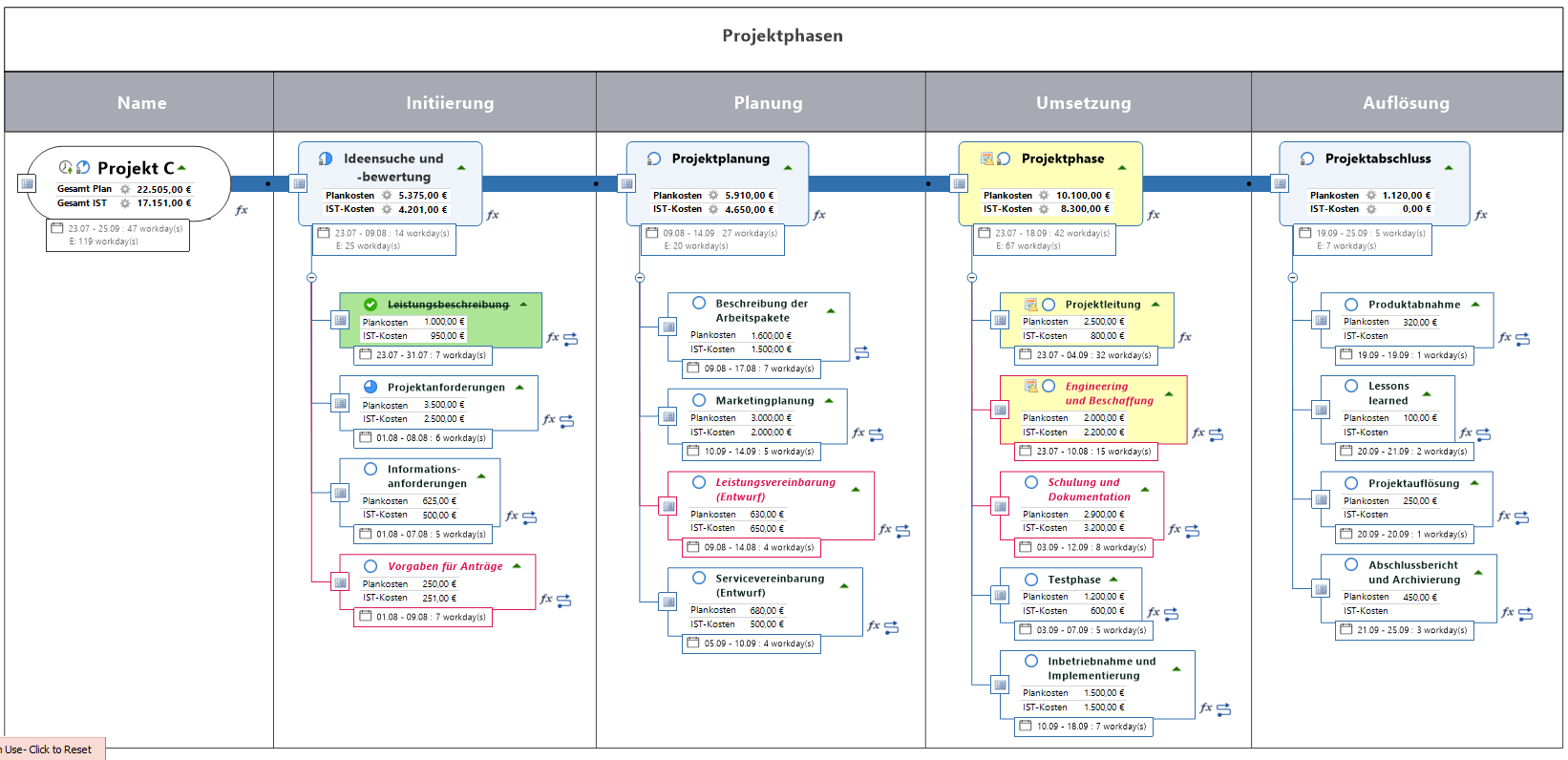
It is worth noting that the map in Figure 6 contains topics that are highlighted by different coloring. In the following chapter, we will discuss the tools, which make this possible.
Try MindManager Today
Rely on MindManager to implement digital projects and processes in a visual, collaborative and smart way! Try our free 30-Day Trial.
About the author:

Dr. Steven Bashford, Director of Technical Services EMEA at Corel. In this capacity, he has been heading Mindjet’s presales, training and consulting divisions for more than 17 years. He makes a significant contribution to MindManager’s continuous product development.

