Elvis Costello once said that writing about music is like dancing about architecture. The remark was meant to be dismissive, but the analogy itself is rather intriguing—especially when extended to music visualizations, which use isolated sonic elements and compiled metadata as a sort of conceptual framework to uncover unique insights about songs and bands. Visualizing music, then, is like using architecture to describe dancing…. and composing, arranging, and other musical components.
There have been some truly excellent music visualizations in the past few months, covering everything from the relationship of notes within a song to the impact changing recording techniques have had on sound quality. The range of topics and outstanding design work displayed in this year’s crop of music visualizations made selecting the best of the best a difficult task. Still, several visualizations stand out for their aesthetically unique design and creative use of data.
Let’s examine three of the most interesting visualizations and consider the design elements that make them engaging and informative, and discuss how we can apply those visual tactics to our own work lives.
Ride the Visualization
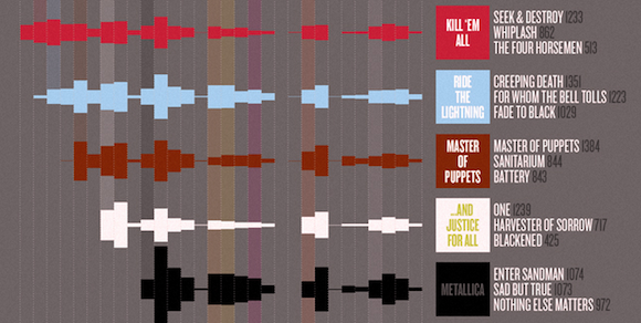
It’s not unusual for die-hard fans to pay tribute to their favorite bands with meticulously detailed pieces of art spray painted on vans or tattooed on backs. The “Metallica on Stage” infographic doesn’t feature wizards or volcanoes, but it does document three decades of Metallica concerts in impressive detail. The top half of the graphic entices both record store clerks and data geeks with a deconstruction of set lists that identifies the number of times particular songs have been played.
The sheer volume of information embedded in the graphic could easily lead to a cluttered, “busy” layout. This is a problem familiar to anyone who has worked with big data sets. While we can often intuitively sense information overload when our data no longer fits on the graphic, there is a tendency to press on by tinkering with the margin settings, shrinking text size or overlaying graphs. Visualization, of course, is meant to filter out unnecessary data and draw a viewer’s attention to key facts or trends. But that task is easier said than done, especially when a business or organization wants to highlight several different concepts in the same graphic.
Fortunately, integrating more data doesn’t always require adding more visual elements. The designers here demonstrate that you often can accommodate additional information by thinking laterally. For instance, the colors used to depict particular albums were chosen to reflect the original LP artwork so that fans could instantly grasp the data depicted. Interestingly, the different musical approaches evident on newer albums such as Reload and St. Anger are also reflected in those albums’ more colorful designs, thus providing a natural visual grouping.
Seeing Sounds
Sound Shapes is likely the first video game based on synesthesia, the comprehension of sounds as shapes and colors. This game is essentially a highly interactive infographic, providing not only graphical depictions of musical elements (bass lines, synth stabs, chord progressions) and lyrical themes but challenging gameplay as well. The game’s soundtrack—including tracks by Beck and Deadmau5—provides the architecture for sprawling worlds that react and pulsate to the beat. Success in Sound Shapes requires total immersion with the score. The combination of high quality music and engaging design makes this game more like a lucid dream than a 2D scroller.
The brilliance of Sound Shapes is that it combines two concepts that reach across cultures and demographics: music and design. Gamers of all backgrounds will be engaged by the interactive score, and intuitively understand the game play logic with no instruction. A similar approach can easily be applied to business visualizations and marketing more generally. Effective use of dynamic graphics can facilitate larger audience outreach without specifically targeting new demographics. You’re probably as tired of hearing PSY’s international hit “Gangnam Style” as we are, but months after that song reached peak cultural ubiquity, it’s still amazing how much traction a song performed entirely in Korean could have with an English-speaking audience (not to mention sales in countries across the globe). Part of the song’s success was surely due to the brilliant video, which added a fascinating visual backdrop to PSY’s playful vocals.
Jukebox Hits
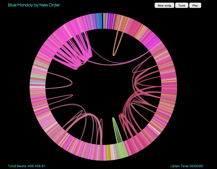
One of the year’s most notable visualizations—music-related or otherwise—was the Infinite Jukebox, an app that creates infinitely long and ever-changing versions of uploaded tracks. The app utilizes the The Echo Nest analyzer to break songs down into individual beats, which can be checked against one another to identify similar-sounding points in the song. The Jukebox randomly jumps between these transition points in a never-ending cycle. Every song generates its own unique visualization that maps the beats around the circumference of a circle and identifies possible transition paths between them.
It’s easy to imagine how a similar mapping approach could be used to identify transition paths between tasks at work. Our day is often composed of small jobs that we toggle back and forth between. Checking email. Writing memos. Going to meeting. Responding to emails. Another meeting. Et cetera. Our workday can often feel the same track on repeat. But by conceptualizing these small jobs as transition points, we might be able to discover more efficient paths between tasks.
Conclusion
What all of these graphics have in common is a unique analytical approach to music that it best represented through visualization. Of course, any song came be depicted as notes written across a page. But that notation is only decipherable to trained musicians and amanuenses. The visualizations above are information-rich, but engaging for both casual and dedicated music fans. These design approaches may be applicable to other visualization projects as well—especially those involving business projects and big data sets.