When working with numerical data, there may be times when you want to visualize how different value sets relate to one another. While a scatterplot analyzes the relationship between two numeric variables, a bubble chart is used to represent three or more numerical values. These charts can also be used to compare categorical variables or visualize patterns and trends over time.
Bubble charts give you a single, comprehensive way to compare data sets rather than using multiple scatterplots or column charts.
In this article, we will explore common bubble chart use cases in business, explain how to create a bubble chart in Excel, and outline how companies may benefit from using MindManager® to make bubble maps.
How do businesses use bubble maps?
Tables of statistics are useful for emphasizing actual values and numerical data. However, they can be hard to interpret when it comes to comparing relative values or looking for relationships between variables. The visual nature of a bubble map helps people make connections between datasets by comparing the size, location, and color of the bubbles.
Organizations use bubble charts in a variety of business contexts, such as analyzing core financial processes. Common use cases include (but are not limited to) the following:
- Competitive analyses
- Customer satisfaction ratings
- Revenue projections
- Risk assessment opportunities
- Valuation and investments
Bubble charts help lead to better decision-making because you can focus on the relationships between variables and compare factors such as value, cost, and risk.
For example, companies use bubble maps to visualize development activities compared to business results. Development activities include processes and actions that drive business growth, such as marketing, project management, lead generation, and data analysis. The frequency of development activities would be on one axis and the business results on the other axis. The number of activities would be represented by the size of the bubbles.
Organizations also leverage bubble charts when conducting a competitive analysis. To do so, businesses collect data such as competitors’ sales volume, market share, and sales growth year-over-year. The sales volume is recorded on the y-axis and the market share on the x-axis. The size of the bubbles represents the year-over-year sales growth, making it easy to determine which competitors are performing better than others. is recorded on the y-axis and the market share on the x-axis. The size of the bubbles represents the year-of-year sales growth, making it easy to determine which competitors are performing better than others.
If your company is planning to launch a new project, a bubble map helps you compare and analyze the cost, risk, and value of potential proposals or strategies. Visualizing this information in a bubble chart makes it easy to identify the project that presents the lowest risk and highest potential return.
How to create a bubble chart
Each bubble in a bubble chart represents a single data point. On the chart, the x- and y-axes represent variables with pre-existing relationships, such as market shares and sales volume for a competitive analysis.
At their most basic, a bubble chart plots a numerical variable on the x-axis against another independent numerical variable on the y-axis. A third numerical variable scales the size of the resulting bubbles. Businesses can also integrate an additional numerical or categorical dataset by color-coding different bubbles.
Legends and labels are key elements of a bubble chart. With three or more variables on display, labels can be used to show what the axes and bubbles represent. Then, a legend can be used to explain the meaning of colors and patterns within the bubble map.
There are several ways to make a bubble map, including in Google Sheets or Microsoft Excel. Here’s how to create bubble charts in Excel:
1. Enter the data
To get started, open a blank worksheet or workbook in Excel. Then, enter in the data set. Make sure that the variables have at least three data columns to generate high-quality results.
For example, consider the following dataset that shows the quantity, cost, and sales values of various products:

Created using Excel
2. Create the bubble chart
Now that you have entered your data, highlight the cells that contain the data set by dragging your cursor through them. Then, click the Insert tab and select the bubble chart option from the Scatter charts drop-down.
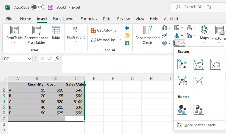
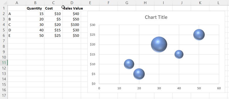
This generates the following bubble chart:
3. Add labels
Looking at the bubble chart, you can see that the x-axis displays the quantity values, the y-axis displays the cost values, and the size of each bubble represents the sales values. However, without labels, you cannot discern which bubbles represent which products.
To add labels to your chart, click on your bubble chart. Then, click the green plus sign that appears in the top-right corner.

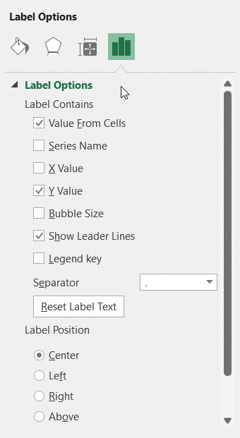
Next, select Data Labels, hover over the black arrow, and click More Options. This will open the Format Data Labels panel in which you need to check the box next to Value From Cells under Label Options.
In the Data Label Range window that appears, enter A2:A6 as the cell range.
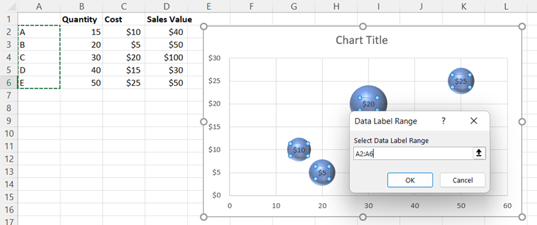
Select OK. Then, go back to the Format Data Labels panel and uncheck the box next to Y Value. Doing so removes the numerical values from the bubbles, leaving only the cell range you selected as the label.
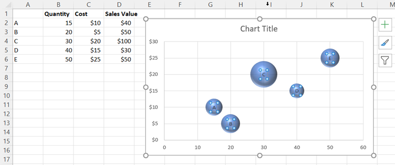
4. Customize your chart
There are several ways to further customize your bubble chart, including:
- Using the Chart Design tab to change the layout, style, and various chart elements.

- Using the Format tab to add color, outlines, WordArt, and other text effects.

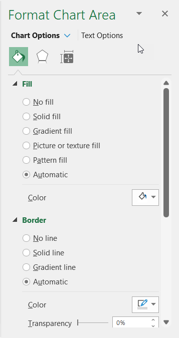
- Using the Format Chart Area panel to change the chart’s size, properties, and visual effects.
Take bubble maps to the next level with MindManager
While you can use Excel to create a bubble chart from your data, the results cannot be easily customized or collaborated upon, so they may not meet your company’s needs. This is why many organizations turn to MindManager. The tool offers a suite of pre-built, fully customizable templates to turn business data into informative charts and diagrams.
MindManager also gives you the benefit of collaboration tools and cross-platform sharing options. Team members can collaborate on maps, charts, and diagrams together in real time—even if users are accessing MindManager on different platforms.
In addition to traditional bubble maps that visualize the relationships between variables, MindManager offers unique bubble chart templates that maximize the value of brainstorming sessions. This type of bubble map is used to spark creative thinking by connecting words and phrases in new, engaging ways.
For example, consider a situation where you need to write a product description. Using the bubble map template in MindManager, you can explore the various adjectives you can use to describe nouns. A software product might include adjectives such as flexible, powerful, innovative, and comprehensive. As you build out your bubble map, you are able to find new ways to describe your products and services.

