By: Leanne Armstrong
Whether it’s information about your company’s finances, productivity, or workflow, the more data you access to carry out your responsibilities, the more difficult it can be to sift through and make sense of it all. That’s where having the right information visuals tools can help.
Visualizing information is an easy way to draw more meaningful conclusions from data. Take, for example, the temperature map displayed with your morning forecast.
By transforming it into an image, weather information that might otherwise take time or be difficult to explain suddenly directs faster understanding and leads to better decisions – like whether or not you should grab that umbrella!
Information visualization lets you present facts, figures, and findings in new ways that go beyond simple numbers and text on a page.
So, we invite you to walk with us as we explore some common information visualization tools you can use to make sharing workplace knowledge and data more rewarding.
[Free eBook] How Visualization Builds Better Strategic Plans
Why visualize data and other information?
Some forms of data can be complicated and challenging for the average person to grasp. But when you use information visualization tools to map out, say, a product comparison or updated procedure, you get your message across painlessly to users and decision-makers alike.
Visualizing data and other information helps you:
- Highlight and convey key points
- Uncover observations that might not be clear when examining facts or figures alone
- Present information to the right people, at the right time, so they can gain the performance insight they need
Information visualization tools include a broad range of digital aids and visual resources that make it easier to view, manipulate, analyze, and discuss incoming knowledge and existing data streams.
Information visualization vs. data visualization
While the terms “information” and “data” are often used interchangeably, when it comes to information visualization vs data visualization, different tools may sometimes be called for.
Information visualization usually refers to the laying out of knowledge paths to gather or form:
- Ideas for solving a problem
- Concepts around the design of a product or process
- Steps in a procedure or workflow
- Tasks and milestones attached to a project
Data visualization, meanwhile, is more about analyzing metrics around the goals and results of those pathways.
While information visualization tools provide an accessible way to see and understand company knowledge as it pertains to your business processes, products, and projects, data visualization tools help you see and understand patterns, trends, and outliers in company data.
In either case, visualization tools let you present materials in a way that’s easy for everyone on your team to make sense and make use of. And you’ll likely discover there’s a certain amount of overlap in the way various data and information visualization tools work together.
3 types of information visualization tools
Information visualization tools combine graphic elements like colors, shapes, arrows, and labels to create both a visual hierarchy and an information trajectory. Overall, their aim is to help users like you apply shared information to reach your workplace objectives.
At one time, your choice of visual devices would have been limited to two main types of information visualization tools: tables and graphs.
- Tables organize, categorize, and label quantifiable data
- Graphs are frequently used to demonstrate relationships among that data
You can access simple versions of both these tools on information platforms like Microsoft Word and Excel. But with today’s software developments, basic tables and graphs have expanded into a dynamic range of interactive visualizations.
Here are 3 types of information visualization tools that are worth taking time to explore.
1. Digital tools
One big benefit of working with digital tools like the ones described here is that you can often use templates to make wielding those tools even easier.
As a pre-formatted file, a template provides a quick and easy starting point for the illustration you want to create. You can construct your own (think Microsoft Word templates, for example) or use the templates built directly into visualization software like MindManager.
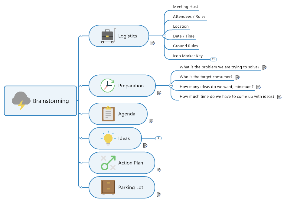
Information maps turn data into a visual landscape that can be scanned quickly for ease of use and direction. By laying out a series of main ideas that branch into more specific ones, visual maps help you brainstorm and display detailed information for across-the-board understanding.
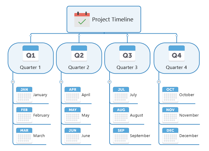
Timelines let you show a list of events in chronological order. Digital timelines like Gantt charts, for example, are commonly used in project management because they not only make it easy to create and update your schedule, they let your team see the dependency relationships between project activities.
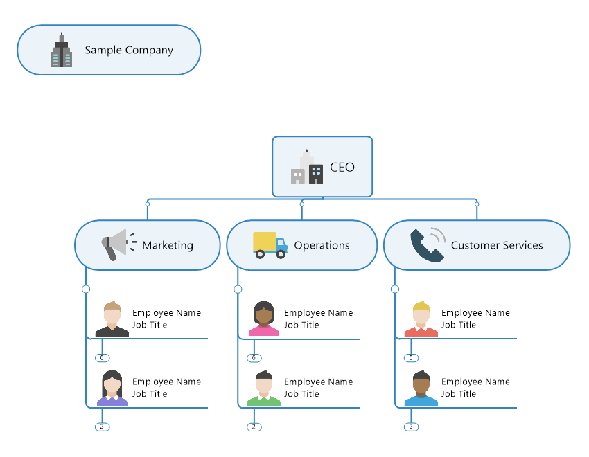
Organizational charts are a convenient way to illustrate the structure of your organization – and a handy tool when you’re hiring or compiling company knowledge. In addition to clarifying roles, responsibilities and reporting relationships, digital org charts are easy to update and add images to.
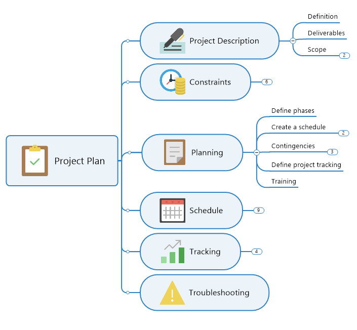
Planning diagrams often take the form of interactive information webs. Tree diagrams and spider diagrams, for example, help teams use data to establish priorities, play out scenarios, develop well-founded strategies, and calculate budget and planning figures.
Video presentation creators help you share information by way of an engaging, animated slide show. While programs like Microsoft PowerPoint don’t lend themselves to real-time data manipulation, they do let you combine text, graphics, and multi-media content into a simplified visual presentation.
2. Information visualization dashboards
Dashboards are visual interfaces that streamline information management. Built into most visualization software, really good dashboards are customizable and essentially serve as a tool within a tool to help you:
- Work with multiple information visualizations, like knowledge maps or flowcharts, to inform and prompt better decisions
- Access at-a-glance views of the tools, templates and KPIs for a specific process or goal
- Perform sound analyses around various types of data

Information visualization and dashboards are a powerful combination that you can use to store, organize, and display information from multiple sources in one central location. External data can be integrated quickly and easily in discussions, for example, then consolidated in dashboards to provide greater clarity.
3. Data and information visualization software
Data analysis programs like Tableau and Google Analytics are designed to analyze company and web data, respectively. Modeling and inspecting data related to market developments or customer traffic, for example, can make it easier to draw conclusions about specific actions your team should be taking.
Information visualization software like MindManager, meanwhile, incorporates many of the tool capabilities discussed here – and dovetails perfectly with the data analytics process.
In addition to a full suite of templates, mind maps, and other digital tools, MindManager’s easy-to-use dashboard is complemented by:
- A library of 700+ topic images
- Calculation functions that include conditional formatting and map-based balanced scorecards
- SmartRules™, which can be used to specify cause and effect triggers to update your map automatically based on new information, missed deadlines, and so on.
- Powerful integrations with apps like Asana, Google Docs, Box, OneDrive and the Microsoft suite of programs
MindManager also offers a range of views and detail levels that make it easy to generate targeted user reports. You can even use it in presentation mode more clearly demonstrate the meaning and intent behind your information.
To find the best information visualization tools for your needs, it’s important to compare what a tool does, with the type of data you tend to collect and the way your team prefers to handle and digest information.
Related article

