By: Leanne Armstrong
The point of any tool is to make your job easier to carry out and complete. Whether you and your team have a problem to solve or a project to plan, using tools specifically designed to streamline the process will help you execute faster and with better results. Collaborating over information laid out in a visual context allows everyone to meet on equal footing. Rather than waste time clarifying a new concept or explaining a technical process, for example, you can use knowledge visualization tools to jump straight into proactive problem-solving or planning.
The most popular visualization tools got that way for a reason: they provide a proven way for you and a partner or group to communicate and implement data, ideas, and insights efficiently and constructively.
In this roundup of widely used knowledge visualization templates and tools, you’ll find illustrative devices that can be customized to meet any objective.
[Free Webinar] Using a Visual Dashboard to Work Faster, Better, Connected
7 types of knowledge visualization tools, and why you should use them
We’ve devised a wide range of methods for communicating knowledge visually over the years: from chalkboards, whiteboards, and flip charts – to images, video, and computer-generated models and maps.
Different as they are, knowledge visualization tools like these have much in common. They were all designed to help us share and fathom different types of information and knowledge so we can achieve a common objective.
Before you set off in pursuit of your goal, however, you should take a moment to nail down a few key factors about the knowledge you’ll need to exchange, including:
- The nature of the information (Is it fact, idea, or expertise-driven?)
- Who you’ll be exchanging it with (Do your partner or team members have different knowledge backgrounds?)
- The main reason for sharing (Do you need to coordinate efforts, promote information recall, motivate a group, generate new insights?)
Once you have a solid grasp of the what’s, who’s, and why’s of your knowledge exchange, you’ll be able to choose appropriate knowledge visualization tools to optimize the process.
Here are some of the most popular methods for visualizing knowledge in a team-based environment, and the situations where they tend to work best.
1. Attention-grabbing tools
One of the main reasons we present information visually is because it’s a great way to gain and hold the attention of an audience. Consider one of these well-established visual aids for your next presentation:
- Flipchart sketches
- PowerPoint presentations
- Physical or virtual whiteboards
2. Tools for knowledge expansion
Certain visual representations lend themselves to the expansion of shared knowledge so different scenarios and outcomes can be investigated. They include knowledge visualization tools like:
- Physical models
- Exploratory sketches and diagrams
- Knowledge maps
3. Memory aid tools
Because we think in images, visualizing information makes it easier to teach, remember, and learn. Popular recall-promoting tools include:
- Infographics
- Spider diagrams
- Software-based visual maps
4. Motivational tools
We’re far more motivated by the visual presentation of information than we are by words alone. Tools known to energize, inspire, and activate group members include:
- Short, punchy videos
- Concept diagrams
- Idea maps that encourage brainstorming
5. Tools that promote insight
Because they clarify context, knowledge visualization tools like the following help create new insights by demonstrating relationships between data, ideas, and workflows:
- Data plotting charts or graphs
- Matrix diagrams
- Swimlane diagrams
6. Collaboration tools
Coordinating shared information so it can be utilized effectively is one of the biggest benefits of knowledge visualization. Illustrative tools that enhance group collaboration include:
- Directional diagrams
- Flowcharts
- Funnel diagrams or charts
7. MindManager knowledge visualization software
As you might expect, there’s a great deal of crossover in terms of what you can accomplish with the visual tools described here. The best way to take advantage of the various benefits they offer is with an all-in-one interface like MindManager.
The MindManager platform brings knowledge visualization tools together in a way that:
- Helps each to benefit and support the other
- Provides multiple coordinated views
- Dramatically improves understanding, learning, and the creation or transfer of information
Illustrating knowledge from different perspectives allows for complementary visualization – a synergistic process that harnesses the power of two or more visual knowledge tools to help teammates better envision, communicate, and innovate.
6 pre-built knowledge visualization templates
MindManager gives you direct access to a wide range of pre-built knowledge visualization templates that do away with the limitations imposed by linear or verbal information sharing.
For example, rather than wading through walls of text, straining to put audio content into context, or trying to make sense of hand-scribbled sketches or brainstorming notes, MindManager lets you both cherry-pick and combine knowledge visualization tools like the ones described here.
1. Mental maps
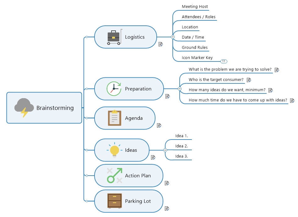
Laying your thoughts out graphically with the help of a mental map allows you to compile and share your ideas far more effectively than any written or verbal exchange. By branching out from one central thought into more specific topics, mental maps structure knowledge in a way that’s similar to the way you naturally think – helping you simplify complex ideas and get more from the brainstorming process.
 2. Swimlane diagrams
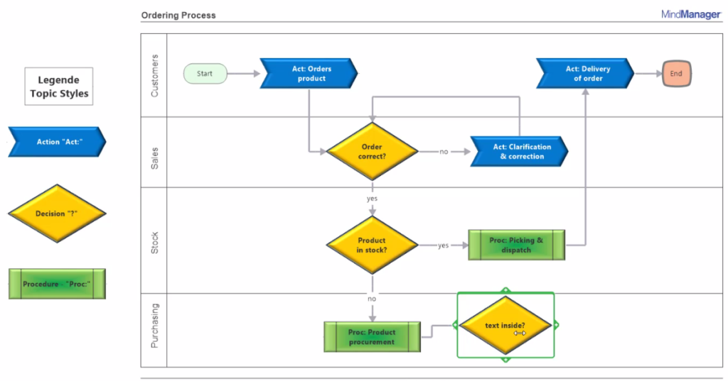
Swimlane and other directional diagrams are ideal for visually outlining process and workflow knowledge. Breaking out and detailing each step along the way not only shows you what needs to be done, how, and by whom, it helps your team see where problems lie and where they can optimize efficiencies.
 3. Matrix diagrams
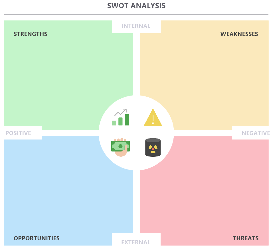
Matrix diagrams shine when it comes to visualizing both the elements of a program, project, or plan, and how they affect one another. Not only does a matrix diagram show the relationships between data, people, actions, and materials, it can help you evaluate how those knowledge assets and variables interact to influence outcomes.
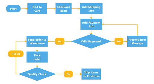
 4. Flowcharts
As a visual map of a process or workflow, flowcharts help you lay down knowledge in a series of sequential stages. By using a symbol to represent each step – and linking those steps with directional arrows – flowcharts are especially valuable for explaining complex concepts and communicating processes without the need for tech-heavy language.
 5. Concept maps
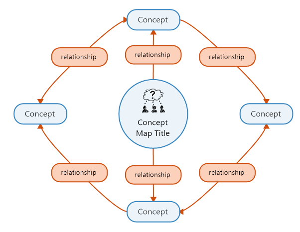
Concept maps interlink ideas visually so they can be better organized for practical use. They’re similar to matrix diagrams in that they, too, display knowledge relationship connections. But rather than linking project or process elements, concept maps link ideas based on phrases like causes, requires, or such as. Displaying these relationships visually improves group focus and boosts the brainstorming process.
 6. Funnel charts or diagrams
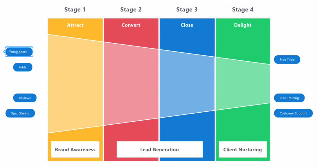
Shaped like they sound, funnel diagrams illustrate the reduction in data that occurs as a process (like a sales funnel, for example) moves from one stage to the next. Because they let you quickly see which parts of a knowledge process are flowing well, funnel charts also show you which are in need of improvement.
 Any time you and your team have the opportunity to use visual maps or similar knowledge visualization tools to transform ideas and information into mutual understanding, you stand to meet your goals faster and more effectively.
MindManager’s built-in visualization tools and templates, flexible diagrams, and other dynamic illustration options can be used alone or in combination across your joint projects.
By bringing the most popular and practical knowledge imaging tools together in one place, MindManager makes it easy to take your knowledge visualization process to an entirely new level.

