
An article by: Dr. Steven Bashford, Director of Technical Services EMEA, Corel GmbH, Division Mindjet
The third part of the blog series discusses the simple analysis capabilities and the flexible switching of perspectives, where the reduction of complexity plays a major role, as well as the possibility to focus on relevant data.
You can find other articles on “The Power of Visualization in the Digital World” here:
- The Power of Visualization in the Digital World – Part 1
- The Power of Visualization in the Digital World – Part 2
Simple analysis and flexible views
 MindManager offers several powerful tools to analyze and assess data.
- Interactive views to quickly change perspectives and view data from different angles
- Filters on different criteria of topics to quickly focus on certain content, to retrieve specific information and reduce the complexity of data
- Conditional formatting, for example to highlight data that harbour risk, to avoid overlooking important information
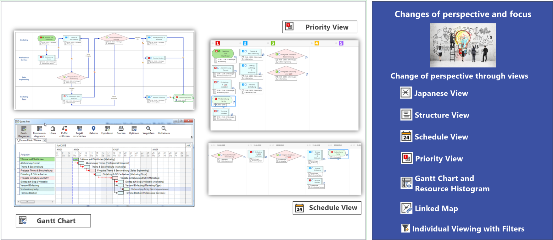
Interactive views
MindManager offers several different, interactive views of the data within a map to be able to view the same information from different perspectives. Interactive means that you can change the information in each view. In addition, you can select the topics of a map based on certain criteria so that only specific topics of a map are visible in the view. For example, the Priority View compares only topics with priority icons in tabular form. Like filtering, it puts the focus on a reduced amount of data that is of interest. But optionally, you can also view topics without priorities in order to add priorities by dragging and dropping them into the corresponding column.
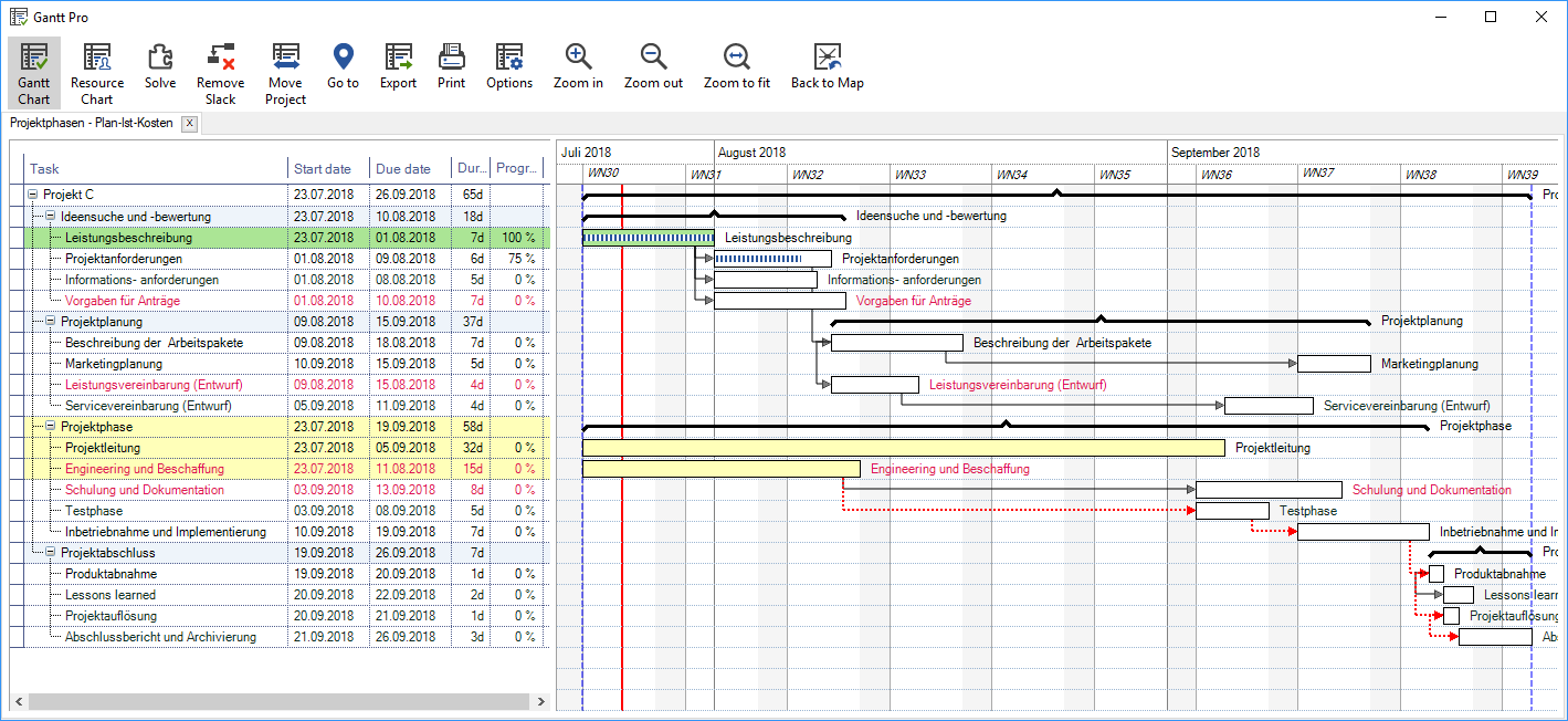
The interactive Gantt View (Figure 7) allows for a better visual representation of the chronological order and the dependencies of tasks, whereas the map emphasizes more the structural relations. In addition, the Gantt View includes a resource view that shows the tasks for each resource and highlights overloaded and under loaded areas.
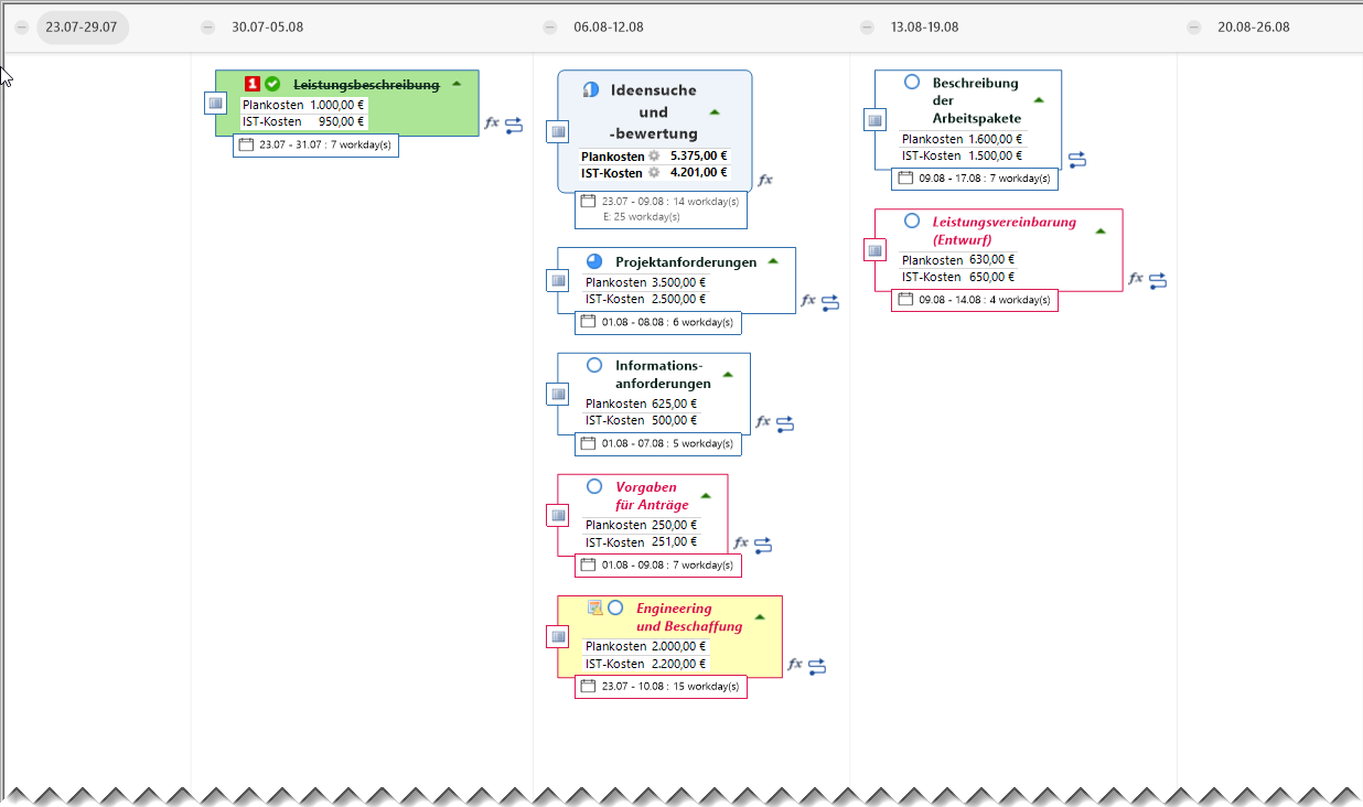
The interactive schedule view (Figure 8) provides a calendar-based task representation that shows start dates or due dates. This is useful in complex project plans to quickly view what task is due in a specific week or what tasks you must start. But the Schedule View is also useful for simpler task planning where a Gantt chart would be too comprehensive. Additionally, unlike the Gantt View, the calendar view allows you to work with only one end or start date.
Other available views include the outline view and the multi-map view, and coming MindManager versions will introduce more views.
Filter capabilities
An important tool in MindManager is the ability to mark topics with symbols and tags (in MindManager, they are called map markers). Symbols and tags serve to categorize and/or qualify topics. For this purpose, each map is associated with a legend (known as index in MindManager), wherein you can create groups of symbols and tags, and assign meanings to them. There are predefined indexes, but you can add customized groups, symbols and tags to them. Each map has its own index, and after customizing a map to a specific application you can save it as a template for reuse.
You can allocate any number of symbols and tags to each topic of a map. In addition to categorization, symbols help to identify and find certain topics more quickly based on visual indicators (the symbols). Using the filter capabilities, it is possible to reduce a map to topics with certain criteria. You can also define complex filter criteria, which can include other criteria of topics, such as fill color or task information.
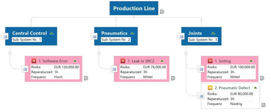
It is particularly important that the user can filter by topic properties because they are indicative for qualitative and quantitative figures. Filtering helps to focus on or find specific content and to more quickly identify further correlations (Figure 11 – cases of failure from Figure 10 filtered by risk costs > €75,000.00). The fundamental goal is to always reduce the complexity of information in order to get greater clarity.
But you can also consider filtering to be a special view. To allow for quick changes, the user can define complex filter criteria in the so-called Power Filter, storing these filters as saved queries for each map. Thus, you can quickly change between different filters by simply invoking a filter name.
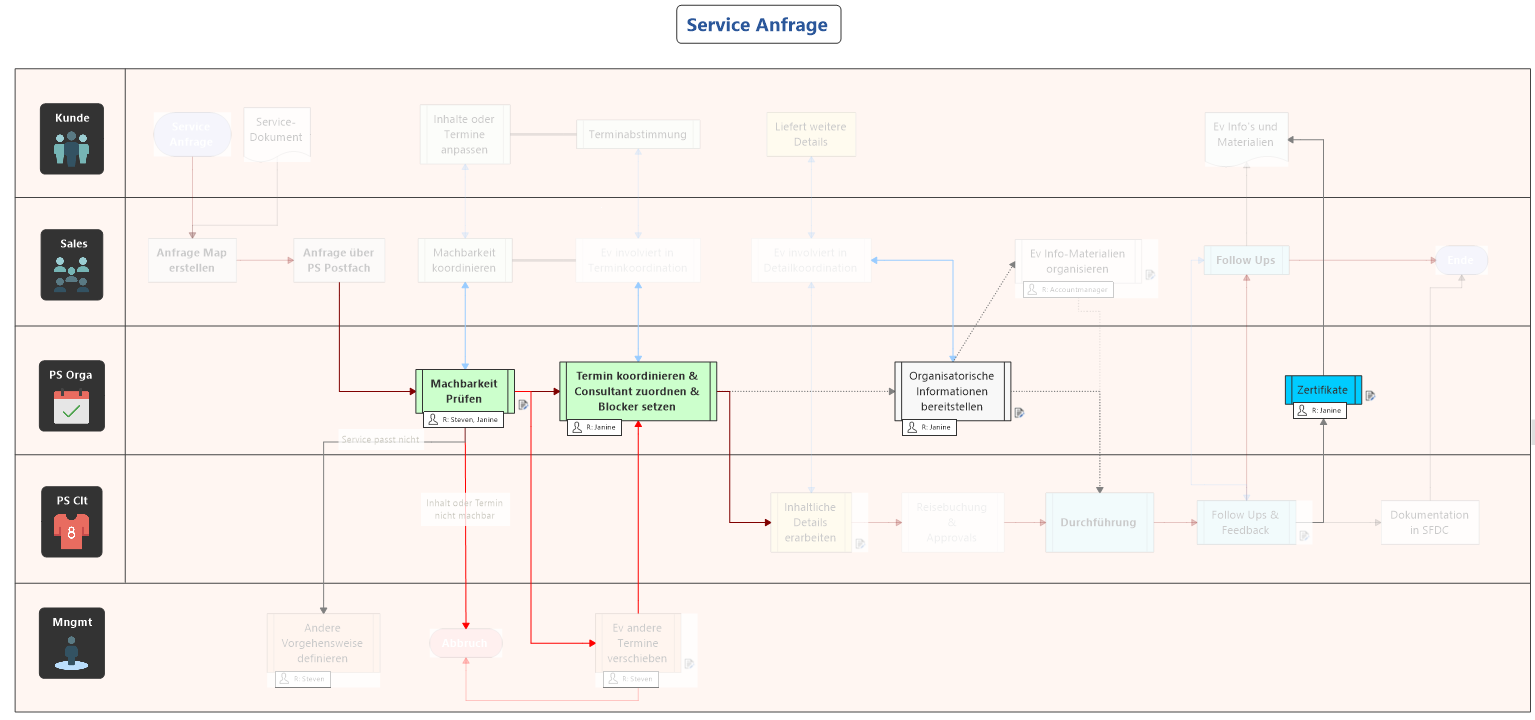
There are different filter options that enable you to control the filter behavior. You can specify whether to display or hide topics that match the filter criteria. Another useful option is the fading out of topics. The topics remain visible, but the focus is not on them. This is very useful in flowcharts and concept maps to not lose sight of the context (see Figure 12 – the Swimlane Diagram was filtered by the ‘Janine’ resource).
Conditional Formatting
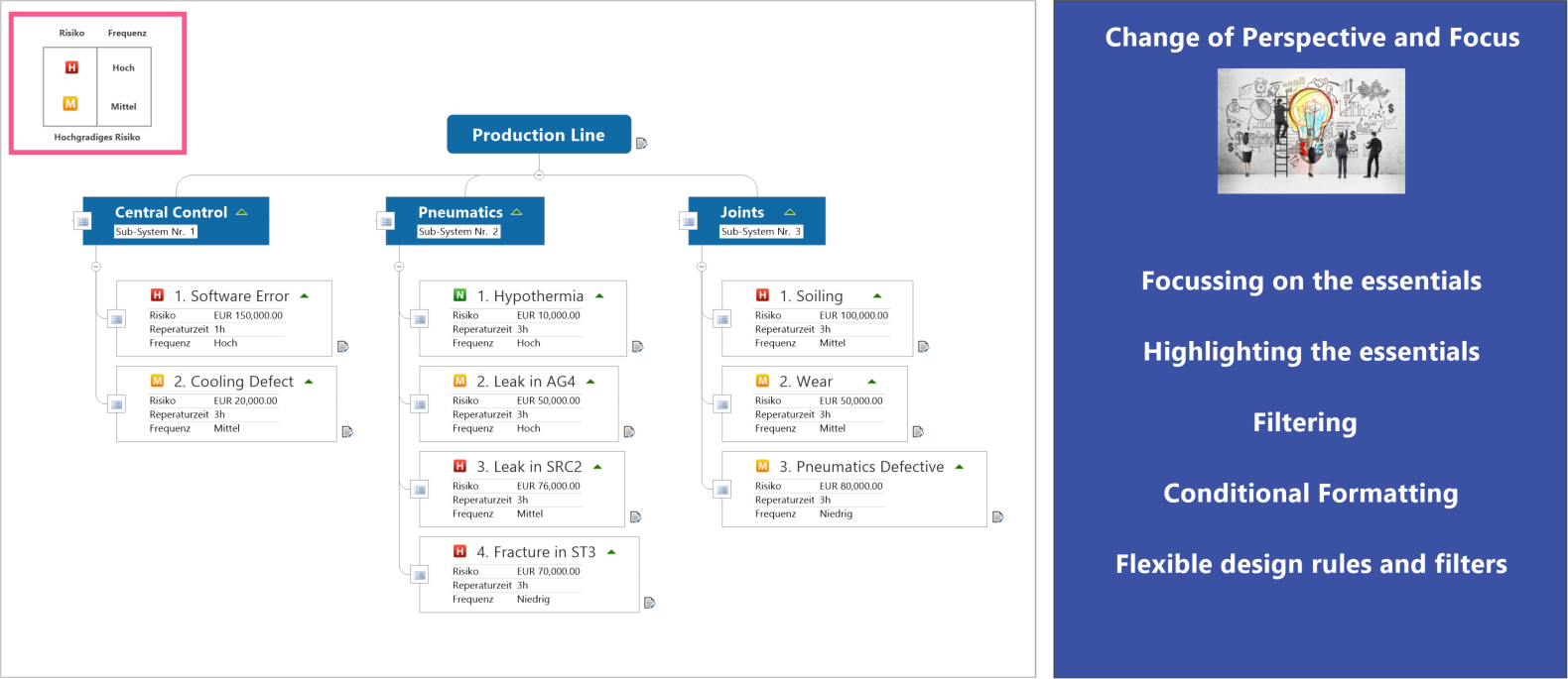
MindManager 2018 introduced another powerful analysis tool – conditional formatting. Conditional formatting allows to define rules for formatting which in turn are based on complex criteria of topics, such as map markers, fill color, task information and/or topic information. The formatting (fill color, text color, topic shape, font and size) automatically highlights certain topics in the map, making critical or important information visible, so that you won’t miss any relevant content. In addition, it is possible to filter the content by these formats.
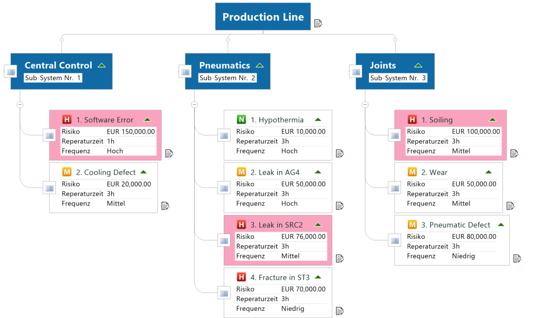
Figure 9 shows a quick example of potential cases of failure in a production line. The symbols ‘H’, ‘M’ and ‘L’ stand for high, medium and low risk of error. The topic properties contain key figures for risk costs and error frequency. Another rule was introduced to additionally highlight all topics with the ‘H’ symbol and a medium or high frequency as posing a particularly high risk (represented by the fill color magenta).
Importantly, you can set up complex combinations of conditions on various topic elements – the same way as when filtering. Topic properties containing key figures and key indicators play a fundamental role in conditional formatting, besides map markers (for categorizing and qualifying topics) and task information. As shown in the example above, you could also set up rules to highlight all topics that have a ‘H’ risk category and whose cost exceeds a specific threshold (for example, > €75,000), using red font color and bold type. Or you could define formatting which indicates threshold bands. For example, a green font color indicates a cost range between €0.00 and €50,000.00 (cost > 0.00 and cost <= 50,000.00), an orange font color indicates a cost range between €50,000.00 and €75,000.00 etc.
It is important to point out that you can set up individual rules for each map to be able to optimize the number of rules for each application. You can then save corresponding maps as templates for specific applications and save the rules in a central library for reuse. Additionally, by being able to turn rules off and on, you can effectively control what criteria to highlight at a certain time. This is particularly useful when defining various rules with different formatting that could cause visual clutter in the map. By turning rules on and off, you can always focus on what is especially important now.
Try MindManager Today
Rely on MindManager to implement digital projects and processes in a visual, collaborative and smart way! Try our free 30-Day Trial.
About the author:

Dr. Steven Bashford, Director of Technical Services EMEA at Corel. In this capacity, he has been heading Mindjet’s presales, training and consulting divisions for more than 17 years. He makes a significant contribution to MindManager’s continuous product development.